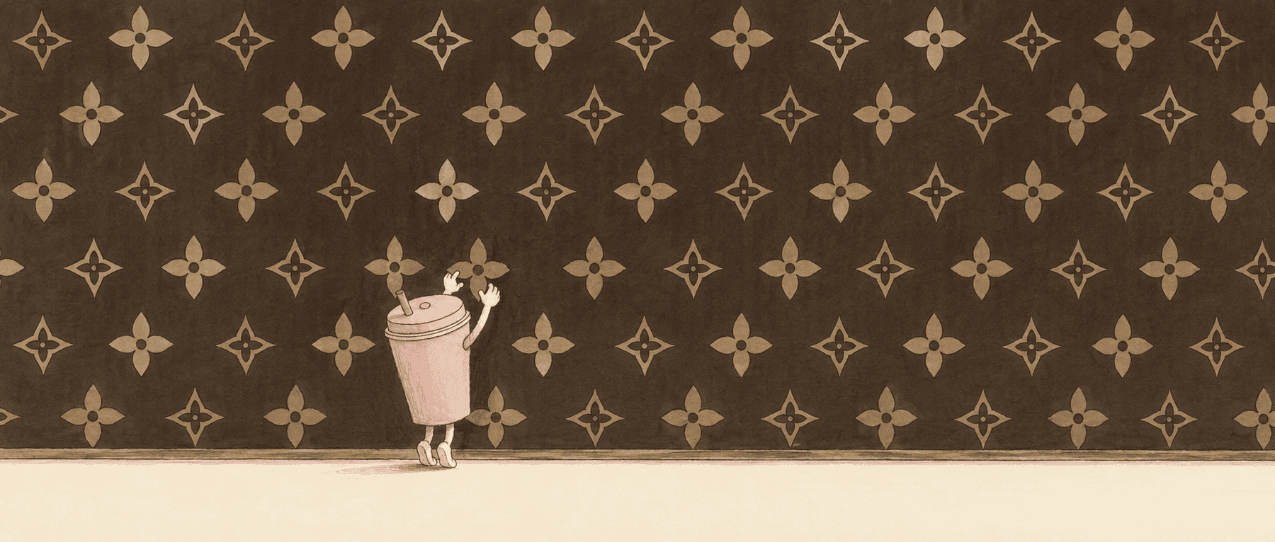
The case itself is simple. A Chinese court ruled that MOLLY TEA — a Chinese premium tea chain that has spent its whole short life looking expensive — had infringed seven of LV’s registered trademarks by plastering its packaging with a four-petal flower. Damages: 10.3 million yuan, about $1.4 million. What isn’t simple is the reaction. The internet split into two camps the same day. One side said a small brand riding on a big one got what it deserved. The other side said the four-petal flower is a thousand-year-old ornament, so who is LV to own it.
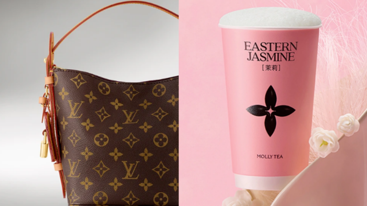
Whether the infringement stands is the court’s call, not a designer’s. But there’s a version of “who’s right here” that only a designer can see, and that’s the one worth looking at.
Why MOLLY TEA had to have that flower
Start with the strangest thing in the file.
MOLLY TEA is not short on design budget. At its size, commissioning a beautiful four-petal flower that looks nothing like LV’s would cost roughly nothing, and be completely safe. It didn’t want that. It applied to trademark the four-petal figure and got rejected. Kept using it. Applied again, had the mark invalidated, kept using it anyway — all the way to the defendant’s chair.
Most people read this as a company chancing its luck. I read something else. On the one question that matters here — where does premium feel actually come from — MOLLY TEA may be the only company in the business that refused to lie to itself.
Think about how most brands do it. Someone opens a project, writes a brief demanding “Eastern elegance, texture, premium.” The designer turns in twenty rounds, the boss picks one, and everyone talks themselves into believing it now looks premium. MOLLY TEA skipped that ritual. What it did amounts to an admission: premium feel is not something a designer can draw, because it was never on the canvas. It’s inside LV’s flower, already made, there for the taking.
Its read on where premium lives was exactly right — right enough that a court valued it at $1.4 million, and nobody spends three years litigating over a thing that doesn’t exist. The company got one thing wrong, and only one: that flower has an owner.
How a plain little shape comes to mean “expensive”
So how was the premium feel inside that flower actually manufactured? Take LV’s own history apart and there are exactly two steps.
Step one: the relay. When Georges Vuitton drew the Monogram in 1896, he was a borrower himself. The quatrefoil came off church windows; the floral motifs came off aristocratic fabric. Those patterns were already “premium” in the old world, and that premium wasn’t drawn either — a single handwoven textile really did take a year to embroider, the people who could afford one were rich by definition, and the pattern was just the mark left behind by real scarcity. From the moment the idea existed, premium feel has been passed hand to hand like a baton, and under every hand-off sat that era’s hard money. So the line “the four-petal flower is ancient” is true, and it does nothing for MOLLY TEA’s case. What the ancients passed down is the shape, and shape was never the valuable part. The valuable part is in step two.

Step two: the bookkeeping. Once it took the pattern, LV spent 130 years doing one thing — making sure that everywhere this flower turned up, “expensive for a reason” came true. The trunks really did last. The craft really was solid. The stores really did open in expensive places. A hundred and thirty years without once wrecking the name. Every time it delivered, the equation “four-petal flower = premium” got one more entry in the consumer’s head.
You can see how serious this step is in the moves luxury houses make that look insane from the outside. Spending fortunes to hunt counterfeiters worldwide is not really about forcing customers to buy the real thing. It’s about controlling who gets to write in the book. Fake hardware peels, fake stitching runs crooked, and the person holding the fake doesn’t think “fakes are bad” — they charge the bad memory to the four-petal flower. Destroying unsold stock rather than discounting it follows the same logic. The moment the price softens, the brand erases its own entry for “expensive,” and “expensive” is the single most important line in the book. On the income statement these are all costs. In the ledger they’re assets.
With both steps in view, the opening question answers itself. “Make it more premium” is not a designer’s output. It’s the balance in a ledger — the weight handed down through the relay, plus every entry the brand cashed out on its own. A designer can draw the shape that carries the balance. The designer cannot draw the balance. A client asking a designer for premium feel is a client walking up to a mint’s plate-engraver and asking for purchasing power.
Public taste gets quietly rewritten
So why does the whole world believe premium feel lives inside the shape? Why does “make it look more premium” sound so reasonable?
Because the ledger is invisible. It sits backstage. No customer stands at the counter running through 130 years of LV craftsmanship in their head, and nobody pulls up a brand’s goodwill record at a tea-shop door. The book can’t be seen. The logo can. So people file the invisible work under the visible thing — the only place it can go. The flower becomes the cover of the whole ledger, and given enough time everyone assumes the balance is printed on the cover.
This isn’t anyone being stupid. It’s compression the brain has no choice but to run. Nobody can carry 130 years of verified results around, so folding all of it into a shape you recognize at a glance is the only cognitively affordable option. And this is exactly what brand visuals are for. A logo is a cache of trust — it lets a stranger finish, in half a second, a trust judgment that would otherwise take years. Walk past a tea brand you’ve never tried, catch the familiar four-petal flower on the cup, and “probably not cheap” installs itself in your head before you’ve checked a supply chain or asked a soul. Every business that scales wants a logo, not because it’s pretty, but because getting a stranger to trust you fast is the most expensive step in any business, and a symbol is the only thing that speeds it up.
But the cache has a built-in flaw: it reads the cover and never checks it against the book. How big is the flaw? Big enough to measure. Researchers at Caltech poured subjects the same wine and put a cheap price tag on one glass, an expensive one on the other. The drinkers didn’t just say the “expensive” one tasted better. Brain scans showed the pleasure-processing regions actually lighting up more. Not bias — the label changed the taste. Price took part in generating the experience of “good” itself. So aesthetic judgment was never a module running on its own. Price, scarcity, context, who else is using it — all of it gets stirred into the final verdict on whether something looks good. Rewriting public perception of beauty, it turns out, is not hard.
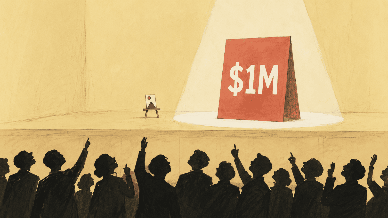
Which is why you see this: a rare Pokémon card sells for a fortune, and a lot of the praise isn’t “it’s worth a lot,” it’s “the art is insane” — hand the same card to a working designer, grade it by the craft, and it’s unremarkable. Bentley’s oval taillights are honestly a little awkward, but nobody calls them ugly; they call them “a brand signature,” “unmistakably Bentley.” Put the exact same shape on a cheap car and the comment section turns nasty. It isn’t that the public has no judgment. The public’s judgment gets rewritten by the symbols around it. And once it’s rewritten, what a person feels is genuine — real beauty, not vanity, not compromise. Your eyes voted before your reason got a turn.
That flaw is exactly what MOLLY TEA bet on. Stick the four-petal flower on yourself and the public’s trust-cache waves you through; the “premium” the customer perceives is a real experience, no persuasion required. It bet on the mechanism correctly, and the business genuinely took off. The only problem was that the book under the cover belonged to someone else, and the account holder eventually came knocking.
$1.4 million is a fair price
Someone will say: they kept using the mark after it was rejected, so this was obviously deliberate. Right, deliberate — and deliberate with the math done. A tea brand borrowing from a luxury house, a challenger borrowing luxury cues to look up-market, is the default move across the entire new-consumer boom; the only variable is how close you borrow. It’s rampant in China right now, but the mechanic is universal. MOLLY TEA just did what everyone does, and did it far enough to land inside a court’s sentencing range. So the real question isn’t whether it cheated. It’s whether the trade lost money.
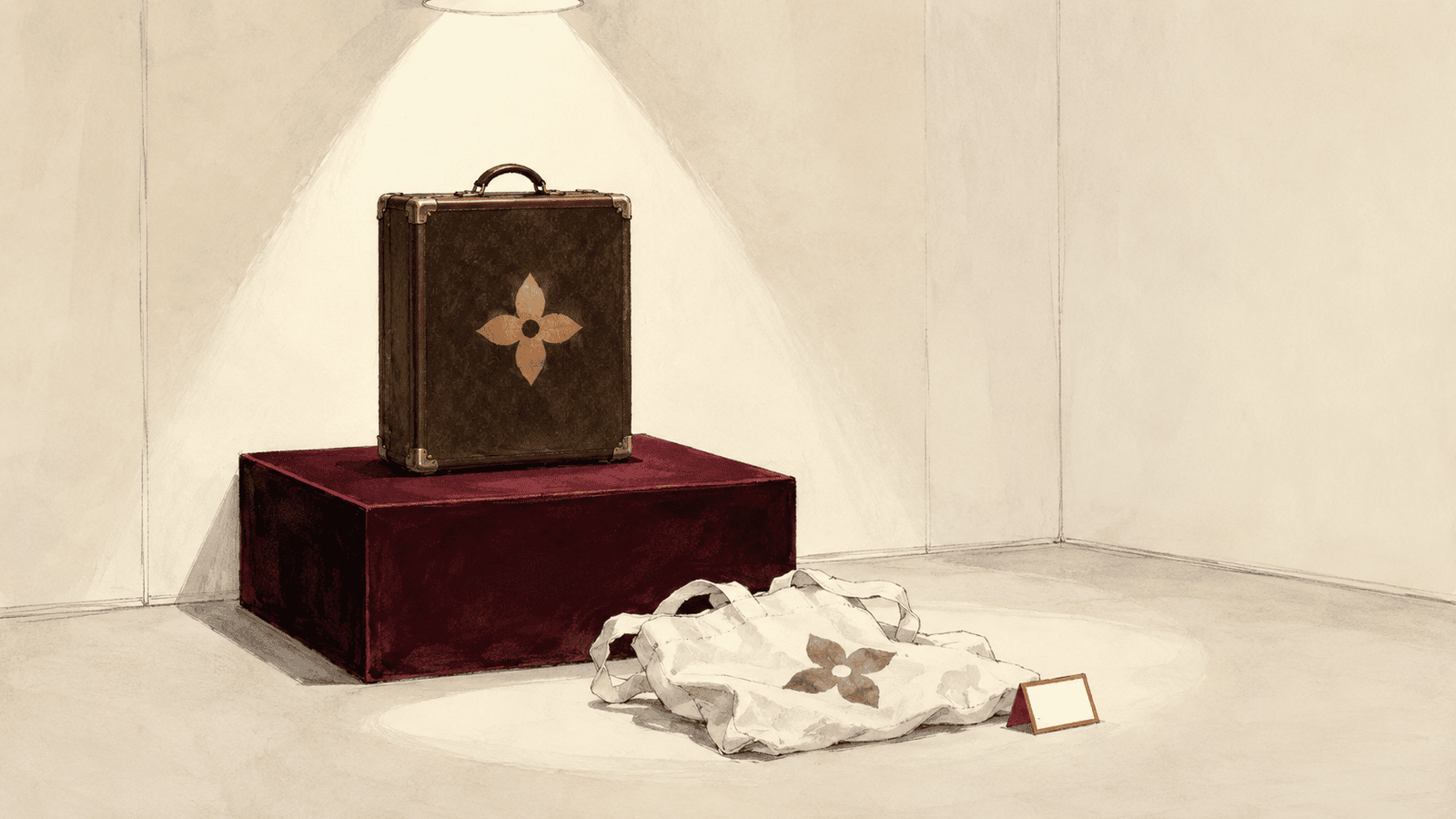
Let’s actually run it. MOLLY TEA opened its first store in Shenzhen in 2021 and spread nationwide over five years, holding the same slot the whole time: the premium option in Eastern tea. Getting a stranger to believe in half a second that you’re premium is the single most expensive line item a new brand has. The normal path is to hire a top-tier agency for a full brand system, then burn years of marketing to raise a new symbol into trust one notch at a time — that bill only runs higher, and money can’t buy the time. The 130 years banked in LV’s ledger are not for sale at any price. The borrowed cover let MOLLY TEA skip the most expensive step outright. Five years later, the account settles: $1.4 million. You’d have a hard time calling that a failed trade.
This is what the ruling is really worth chewing on for anyone in the industry. Its intent was to protect the ledger. Its actual effect was to post, for the first time, a price list for borrowing one: keep your own book, 130 years; license a co-brand, list price; just take it, $1.4 million — and for a brand moving fast enough, that last option may not be the most expensive one. After the ruling, MOLLY TEA started pulling the flower off its stores, and the court ordered it to post a statement on the homepage of every official account — which amounts to ordering it to publicly restate the account, right there on its own cover. How much of the “premium” it built over five years survives once the cover comes off, the whole industry will watch over the next year or two. That answer will be far more honest than the verdict. It will tell everyone exactly how much of the balance that four-petal flower actually moved.
Can a designer really give a brand “premium feel”?
Back to the line we started with.
It can be answered precisely now: a designer can paint the cover, not the balance. The product and the years are the principal in the ledger. With no principal, the cover can be painted flawlessly and the customer opens it to nothing, then walks off muttering that the brand is a poser. With thick principal, weak design gets logged as “character” — Bentley’s taillights are the proof. The gap between a good designer and a bad one was never about conjuring premium out of thin air. Nobody can do that. It’s earned one entry at a time.
So when a product gets called premium, don’t rush to thank the designer. When it gets called a poser, don’t rush to blame the designer either. Open the cover and read what’s actually in the book, and whether it holds up.
And next time you’re standing in front of something and the words fall out of you — “that’s such premium design” — it’s worth a half-second pause. What you’re praising isn’t the shape in front of you. It’s the ledger the shape is carrying, the one you can’t see. Every extra cent you pay for it becomes another entry in the book, and makes the next person who sees the cover believe a little harder. MOLLY TEA read this loop. It just read it too well — well enough to reach straight in and take.