September 2024, Apple keynote. I watched the backdrop three times before I could move on.

The image was made of iPhone internals — chips, boards, traces — cut into clean silhouettes and arranged across the screen. On top of that, the designer laid a second layer of ornament. Symmetrical, dense, rhythmic. It looked like the rose window of a Gothic cathedral.
The work is serious. The technical eye is there, the aesthetic eye is there. The parts are cut with care. The ornament has the symmetry, density, and pacing of someone who knows what they’re doing.
And it still stopped me.
A chip is saying one thing: this is what our process can do, this is what others can’t make. That’s what the iPhone wanted to say this year.
A Gothic rose window is saying something else entirely: a cathedral, the worldview of stonemasons and priests, the symmetry of a different civilization.
Put both on the same screen and ask which one is serving which. Which one is lighting up the other.
I watched it three times. I couldn’t answer.
I’ve been designing for a long time, and I’ve seen a lot of work that is careful but reads wrong. Sorted out, it falls into three kinds.
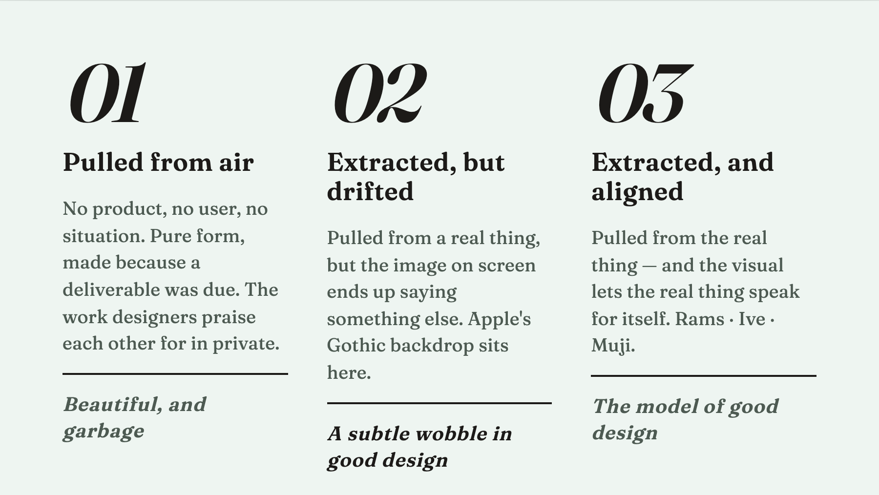
Kind one: pulled from thin air. The designer has no product, no user, no concrete situation to anchor to, but a deliverable is due, so they reach for pure form and make “something beautiful.” This is the work that gets praised loudest inside small designer circles — no product, no user, just designers nodding at designers. It’s beautiful, and it’s garbage. Professionally pretty, but it transmits nothing and lands nowhere.
Kind two: extracted, but drifted. The designer honestly pulled their visual language from something real — a product, a technology, a user, a situation — but what finally emerges on screen is talking about a different thing. The craft is solid. The execution is precise. But when a viewer looks at it, the first thing they read is not what the real thing was trying to say. The Apple backdrop sits here. Yes, the forms came from chip parts. But what the image actually communicates is medieval and devotional, not the technical leap iPhone had this year.
Kind three: extracted, and aligned. The designer pulls from the real thing, and the final image lets the real thing speak for itself. No caption needed. You look, you read, you receive what the work is carrying. This is the model of good design.
The difference between the three is not effort. It’s whether the 1 in front matches the visual that comes out the other end.
Pull these apart and a formula floats up:
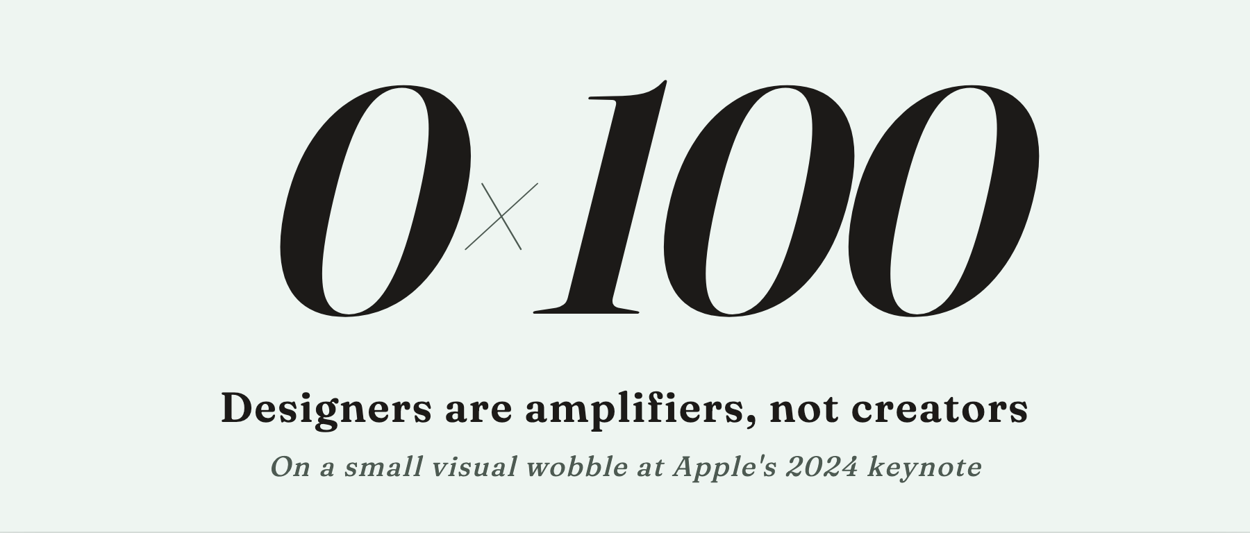
Design is an amplifier. It is the 0. There has to be a 1 in front of it.
A designer’s job is to take what’s already there — the product’s function, the technology’s edge, the user’s actual situation — and amplify it, clarify it, make a person feel it. Kind three points the amplifier at the 1 and the signal arrives clean. Kind two has a 1, but the amplifier is pointed sideways, so the wrong thing gets boosted and the real signal is buried under it. Kind one is an amplifier running with nothing in front of it — what gets amplified isn’t substance, only the appearance of it.
The title says designers are amplifiers, not creators. The creator I mean is the one who makes the 1: the engineer who built the chip, the product person who defined what this thing is, the person who brought a new possibility into the world. A designer is not a creator in that sense. A designer is the 0 that follows the 1 — making it bigger, clearer, faster to read, easier to feel.
This sounds modest. It isn’t. It draws a hard line around what a designer can and cannot do.
Now turn it around. The people we call “design masters” — what holds them up? Push on any of them and you find the 1 standing behind them.
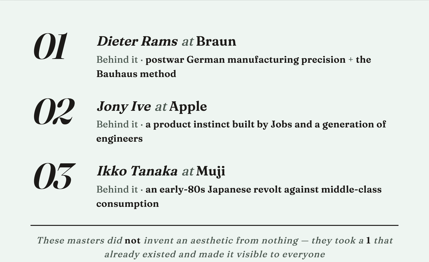
Dieter Rams at Braun. The 1 was postwar German manufacturing precision plus the method that Bauhaus left behind. The radios, the calculators, the shavers — each one is taking those two things and amplifying them into a form an ordinary family could afford, read, and live with.
Early Jony Ive at Apple. The 1 was a product instinct built up by Jobs and a generation of engineers — what consumer electronics could become, what to make, what to refuse. The translucent iMac shell, the iPod wheel, the iPhone glass — each one took an engineering 1 and made it instantly recognizable to the whole world.
Muji. The 1 was an early-80s Japanese reaction against middle-class consumption — refuse the over-branding, refuse the over-packaging, return to the thing itself. Ikko Tanaka’s visual language translated that argument into cardboard boxes, typefaces, and shelf displays.
These people did not invent an aesthetic from nothing. They took a 1 that already existed in their moment and made it visible to everyone.
An amplifier with no 1 is nothing. But the amplifier is also not replaceable — however strong the 1 is, if nobody makes it into something people can see, most people will not see it.
Back to Apple’s backdrop.
It’s not kind one. Apple doesn’t fall that far. It’s kind two: the extraction was real, but the image drifted.
Is this the designer’s fault? Yes and no.
The designer did what a designer can do. The cutouts are precise. The ornament is beautiful. But here’s the situation they were in — if the chip’s actual leap this year isn’t strong enough to carry an entire backdrop, then the designer doesn’t have a strong enough 1 to amplify. From there, only two moves are left. Either admit it and make something quiet — restrained, recessive, a backdrop that gets out of the way of whatever the main act is. Or push through, layer on ornament, style, a motif, and fill the visual weight by other means.
Most designers in that position pick the second move. Not a moral failing — they were dealt a weak hand.
What we see on screen is what that situation produces. It isn’t bad. It’s beautiful. But stand it next to the chip and one question surfaces:
Is it helping the iPhone speak?
Designers are amplifiers, not creators.
Later I want to get into where the 1 comes from, who makes it, and how that work relates to design. There’s also more to say about amplification itself — the same act, done two different ways, can land a signal clean or land it muddy.
One more thing worth being clear about.
This blog writes design criticism, not “pointing at bad work and yelling.” Beating up obvious bad work is a different kind of self-congratulation. The thinking worth doing is finding the one subtle place where a piece of good design isn’t quite holding up, and naming it. Apple’s backdrop is “design worth looking at” in exactly that sense — it’s well-made, and it still doesn’t fully say what the iPhone wanted to say this year.
That subtle wobble is what we’re here to watch.