A metric can tell you how many times a button got clicked. It will never tell you whether the button belonged there. Microsoft forced a floating Copilot button on Office, engagement really did climb — and the company had already written the line that condemned it: intelligence that doesn’t show up at the right moment isn’t a helper, it’s an interruption. What it shipped was exactly the interruption it had defined.
For half a year Microsoft pushed a floating Copilot button into Word, Excel and PowerPoint. Then it admitted the thing was a mistake and pulled it. The strange part isn’t the reversal. It’s that in the same sentence as the apology, the company had to add: engagement actually went up.
Here’s what happened. Starting last December, Microsoft rolled out something called the Copilot Dynamic Action Button. By default it floated in the bottom-right corner, sitting on top of your content instead of staying put in the toolbar like a normal control. Excel users got it worst. It covered cells, blocked the scrollbar, hid data, and made it impossible to grab a clean screenshot. One person described it as “a parrot perched on my shoulder, screeching ‘let me help you!’ the whole time I’m trying to work.” Another asked Microsoft point-blank whether Copilot had designed this thing itself, with no human review. After months of complaints, in May the company relented: right-click it and you can dock it back to the toolbar, pin it to the edge, or just turn it off. The official wording on the way out went like this — “this update increased Copilot engagement, but we also heard that users want more control over how it appears.”
This is worth writing about, and not because Microsoft botched another launch. Big companies botch launches every day. It’s worth writing about because it forced one question into the open: when the data says a design “won,” what has it actually proven?
Engagement going up doesn’t mean you got it right
Engagement going up only proves the button was hard to ignore. It proves nothing about whether it was good. A parrot screeching on your shoulder has terrific “engagement” too — you can’t tune it out. Nobody calls that good design.
There’s a judgment buried here I’ve made before: you can’t take a product’s failure and use it to indict its design. That’s a swap of one thing for another. A thing that didn’t make it might have lacked the resources, or shown up at the wrong time — the design wasn’t necessarily wrong. But the ruler cuts the same in reverse. You also can’t take a metric going up and use it to prove the design was right. Engagement climbed because the button was obnoxious and hard to route around, not because it was useful. Treating that downstream number — whether it falls or rises — as the verdict on the design itself is wrong in both directions. Opposite signs, identical mistake.
What’s stranger is that from one angle the button really was “efficient.” It efficiently shoved more people into clicking Copilot. The problem is exactly that goal.
Data optimizes the target you hand it. Choosing the target is on you.
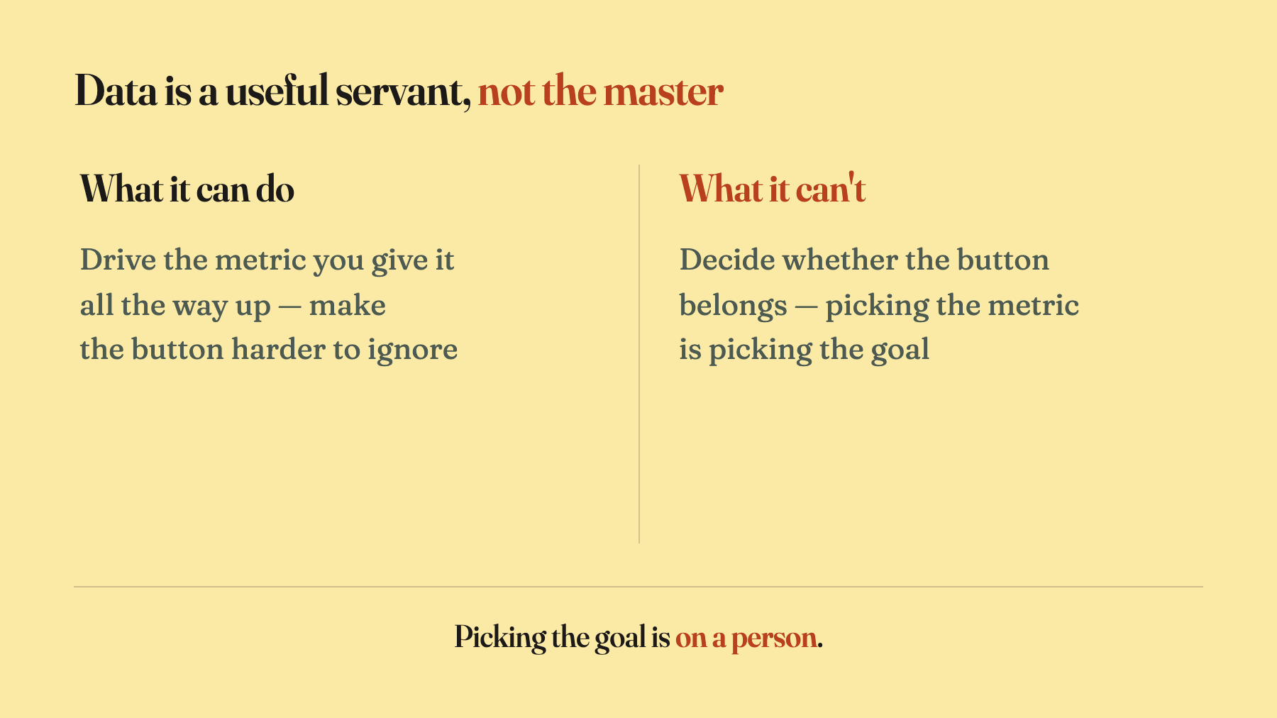
Data is a useful servant, but it does one thing: it takes the metric you hand it and drives it up. It never turns around and asks whether that should have been the metric. Microsoft handed it “engagement,” and it faithfully drove engagement up — did a beautiful job of it. The fault isn’t with the data. The fault is that a person chose “get more people to click Copilot” as the goal, while the user sitting there had exactly one goal: finish the spreadsheet in front of them.
Ask users what they want and you’ll mostly get a faster horse. Data can optimize that horse to perfection — faster, leaner, glossier coat. It will never tell you the person actually wanted to get there faster, and that the answer is a car. The jump from “faster horse” to “car” is judgment. It isn’t a step any dataset can compute.
Google once played this out to the extreme. When its lead visual designer Douglas Bowman left, he wrote a now-famous note: the team couldn’t settle on a shade of blue, so they tested 41 of them to see which got more clicks; he was once asked to prove with data whether a border should be 3, 4 or 5 pixels wide. He said he couldn’t work that way. The point isn’t that data is useless. The point is that when you outsource every judgment to data, you quietly switch off the most valuable thing a designer carries — judgment.
Once data-driven design reaches that point, it starts doing the job backwards. Good design’s actual work is to take the trouble off the user, absorb it, and hand back a clean result. The floating button runs the other way. It shoves the trouble back into the user’s face — smearing it over the spreadsheet, eating half the screen — so one number looks a little better. That isn’t helping the user anymore. It’s conscripting their attention on behalf of a metric.
A floating button is just Clippy with a large language model bolted on
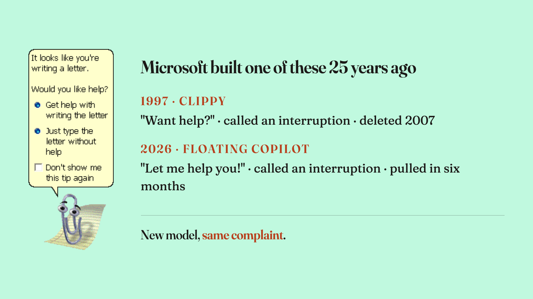
Microsoft of all companies should not have made this mistake, because it pulled the exact same stunt 25 years ago and threw a party to celebrate finally killing it. That pushpin was Clippy, shipped with Office in 1997, popping up uninvited: “It looks like you’re writing a letter. Want help?” The charge it caught back then is word-for-word the charge against today’s button — it interrupted the user. The Smithsonian listed it among the worst software design blunders in computing history. Microsoft turned it off by default in 2001, deleted it for good in 2007, and marketed the deletion as a victory, complete with a little game where you got to throw a stapler at it. The floating Copilot button is Clippy with a large language model bolted on. That’s not me being cruel. Even Tom’s Hardware ran the headline: 25 years after Clippy retired, its particular brand of annoying now lives on inside more than a hundred Copilots.
There’s a mechanism worth spelling out, and it’s a design-judgment problem, not a moral one. Whether an interface is good depends on whether the timescale it serves up matches the timescale the user actually cares about. The floating button optimizes for this second — making you a little more likely to reach over and tap right now. But the user lives on the scale of the next two hours spent finishing this spreadsheet. The second the metric watches and the two hours the user is actually living through don’t line up. That misalignment is the most precise definition of “interruption” there is.
So why did Microsoft do it knowing better? Because it first told the capital markets a story — AI everywhere, Copilot across the whole product line. Once a story is out, a number has to come back to make good on it, and “engagement” got picked because it was all but guaranteed to rise. Data here wasn’t being used to find an answer. It was being used to absolve a story already promised — which is how research and data usually get used inside companies: to backstop a decision, not to find the road. And at almost the same moment, Microsoft was walking back something else — the physical Copilot key on Windows 11, jammed into keyboards in 2024 where the right Ctrl used to sit, which badly hurt the people who work by keyboard shortcut and screen reader, and which everyone now has to remap. Same script, run twice.
The hard part isn’t knowing right from wrong. It’s holding your judgment when the data rewards the wrong thing.
The part of this that stings is that Microsoft knew all of it. It had written the line in black and white: intelligence that doesn’t show up at the right time, in the right place, isn’t a partner — it’s an interruption. That’s sharper than I could put it. It wasn’t ignorance. It understood, and then got pushed by the data into doing the opposite. So the genuinely hard step was never “knowing what’s right.” It was whether, with the number on the dashboard rewarding the wrong thing, you could still take your hand off the button.
Whether a design is right or wrong isn’t ruled by today’s dashboard. It’s ruled by time. When last December’s version shipped, the numbers were green all the way. Inside of six months it became “a mistake.” That dashboard “win” couldn’t outlast the six months of votes users cast with their feet. One more detail gave it away: Microsoft’s eventual fix wasn’t to rebuild the button better. It was to hand the choice back to the user — float it, pin it, return it to the toolbar, your call, and you can turn it off. The original mistake was deciding for the user and allowing no argument. Backing down to “you choose” is itself a confession.
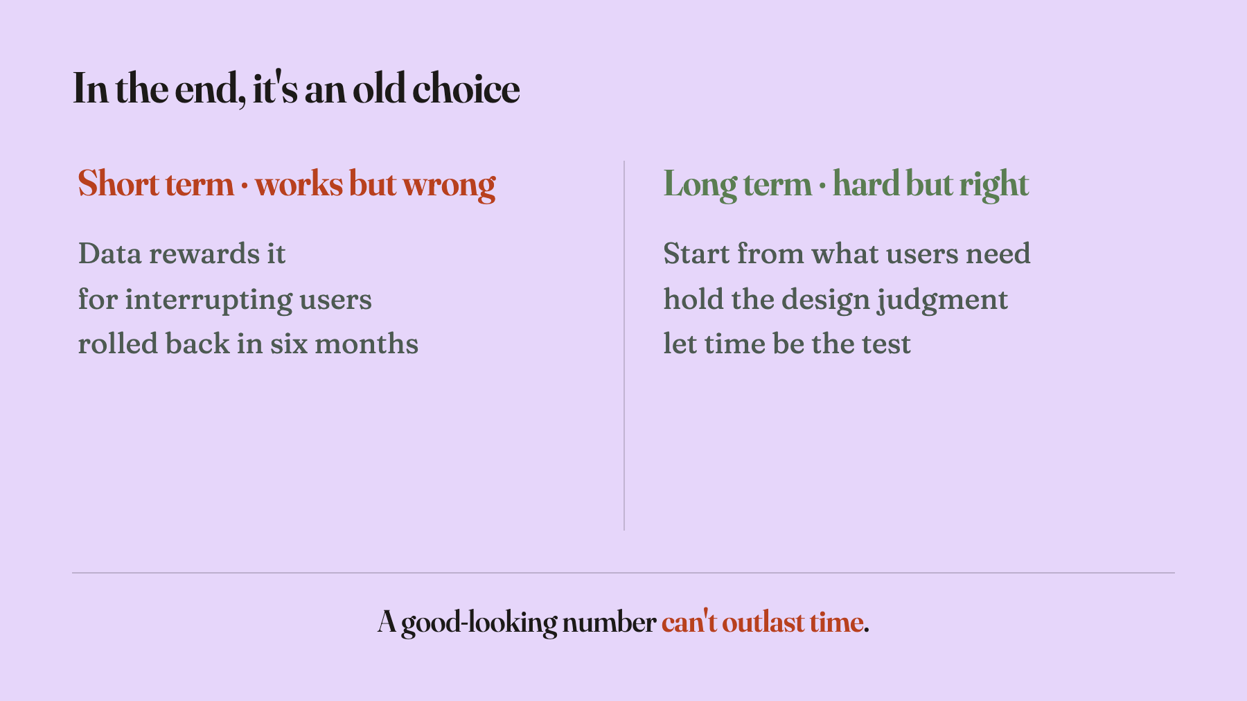
It comes down to an old choice: do the thing that works in the short term but is wrong, or do the thing that’s long-term, hard, and right. The great seduction of data-driven design is that it makes the first option look so well-armed — the numbers are up, what’s left to argue? But that number only answered “how many times did it get clicked.” It never answered “should it have been there at all.” That second question needs a person to step up, reason from the user’s long-term experience, and carry the judgment themselves. It’s hard and thankless, and data won’t do it for you. It never intended to.
Take it small and this is nothing — one button that appeared and disappeared in a corner of Office. But small things hold real ones. When a new technology gets added in, is it solving a problem or manufacturing one? The floating Copilot button gives a fairly clear answer: when you swap judgment for data and experience for engagement, you’re very likely manufacturing a problem, then using a rising curve to convince yourself you’re solving one.
Data can tell you how many times a button got clicked. It will never tell you whether it should exist. That second step is the designer’s job, not the dashboard’s.
The companion piece, Jony Ive Didn't Kill the Screen. He Killed the Cult of the Big Screen., is the reverse case — carmakers chased the all-touchscreen dashboard for years, with the data and the trend both calling it premium, until the long ledger forced it back: glance away two extra seconds at the wheel and your odds of a crash double. One was driven forward by a metric, the other dragged back by reality. Both argue the same question — can a good-looking short-term number outlast the long-term right and wrong.