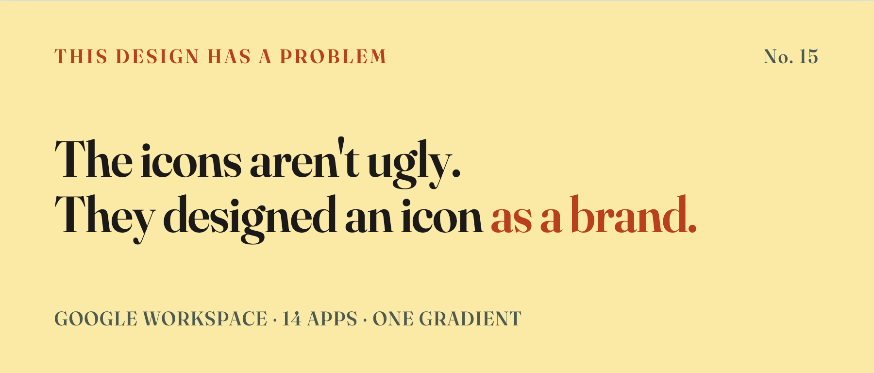
Workspace put all 14 apps under one gradient, and the internet spent a night redrawing them as crumpled bedsheets, a pile of dirt, a flip-flop. The question was never whether they look good. Good tools are supposed to vanish — these got pulled out and played with, and that alone tells you the job was botched.
Google’s icon redesign turned into a meme overnight. But the real problem isn’t that it’s ugly. It’s that they designed an icon as if it were a brand.
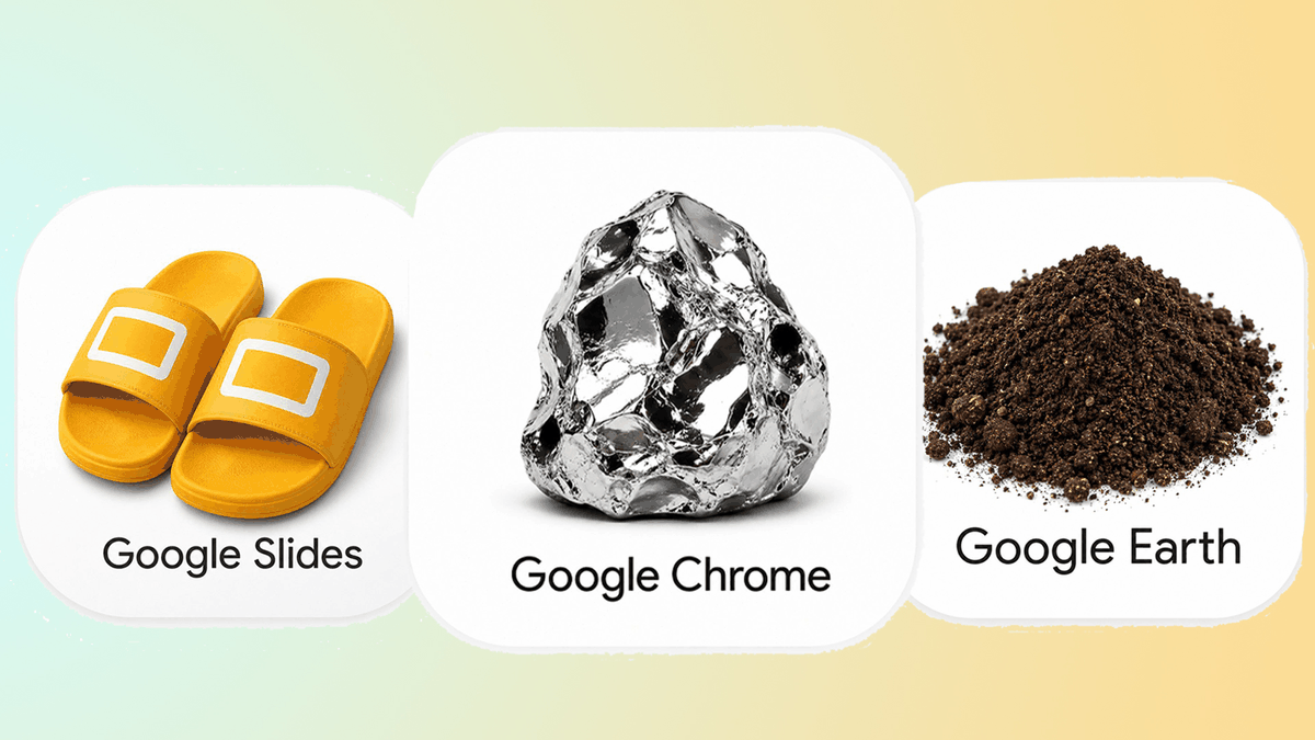
Here’s what happened. On May 18, Google swapped all 14 Workspace apps — Gmail, Drive, Docs, Sheets, Slides, the lot — into a single Gemini-era gradient template. At I/O on May 20 they made it official: these are “bold logos” for the AI age, meant to “unify the whole product family.” Four days later a “hear me out” tweet on X redrew the new Sheets icon as a wad of rumpled bedding, and the copycats poured out — Earth became a heap of dirt, Slides became a flip-flop, each one just the product name translated into the dullest literal object it could name. Even Pichai joined in, reposting a “Google should go into home textiles” gag with two thinking emojis. No denial, no defense. Creative Bloq cut to it with a headline: the parodies are better than the official version.
Anyone can call a new icon pretty or ugly. That’s a private opinion, and not really an outsider’s business. But the failure here lives nowhere near the pretty-or-ugly layer. Google ran the wrong design logic, top to bottom. Let me lay out exactly where it went wrong.
Icons and brands are two different species
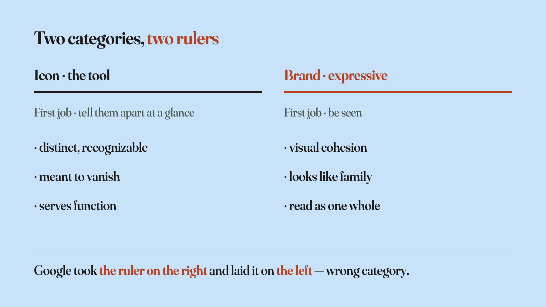
An icon and a brand are two different species, and Google mixed them up. Pouring 14 apps into one gradient so they read like family from a distance — designers call that visual cohesion. It’s the logic of luxury and fashion. Gucci’s spring line wants a unified look; every Patek Philippe dial wants to be recognized as a Patek at a glance, because being seen is the entire job. A brand’s task is to be remembered as one thing.
An icon’s task is the exact opposite — to let you tell at a glance which one is which. It’s the entry label on a tool. You don’t want them to look like family; you want “I tap this one and I don’t have to think about where it takes me.” That’s almost the reverse of visual cohesion. Gmail and Sheets have no reason to rhyme with each other at favicon size. They need to grow up separately, never confused for one another.
Google took the brand logic of being seen and forced it onto tools that are supposed to be used. You can watch the result in your browser tabs: a dozen little icons, all the same blob of gradient, the subtle shape differences smearing into mush at 16 pixels, until you have to stop and read the label to know which is which. The designers aren’t clumsy. The job was wrongly framed from the start — an icon built as a brand.
Good utilitarian design is the kind you never notice
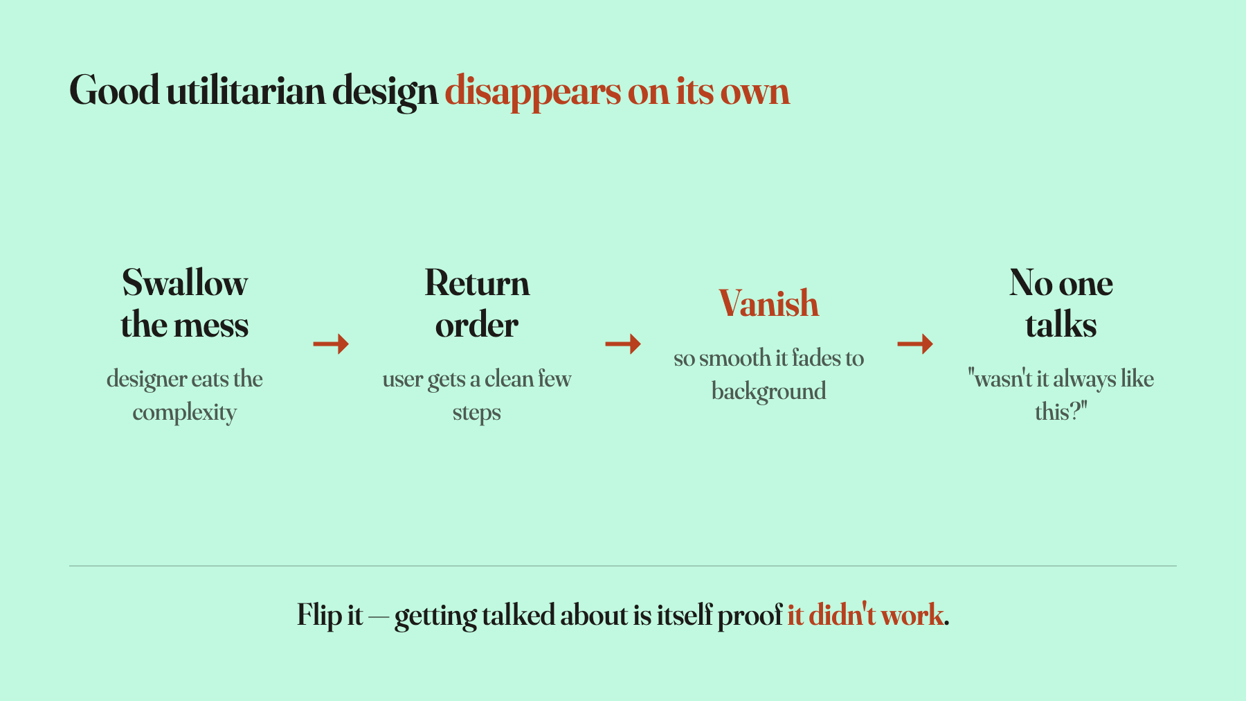
This kind of design has a fate outsiders rarely feel but insiders hit every week: the better it works, the more invisible it gets.
Everyone who builds product interactions has heard the same joke. You inherit something so tangled it’s barely usable, you tear the whole flow apart and rebuild it, you swallow every bit of complexity the user shouldn’t have to carry, and you hand back a clean few steps. It ships, the client glances at it: “That’s it? Wasn’t it always supposed to work like this?” The better your work, the more obvious it looks to them. That’s not the client being unkind. It’s the trade’s destiny. Good utilitarian design swallows the mess and returns the order, and once the order feels natural, the design itself disappears into the background.
Don’t believe me? Think about the apps you open every day. Did their icons change last year? You probably can’t remember. That you can’t remember is exactly the proof it worked — always in front of you, never in your way.
This holds only for utilitarian design, and that matters. Luxury, fashion, art are a different species, born to be seen. Ferrari’s prancing horse, Hermès orange, Gucci’s double-G — none of them can vanish; being seen is their actual job. Google’s mistake isn’t some empty line about how “design should be invisible.” It’s that they took the ruler made for luxury and measured a tool that was supposed to disappear.
Getting talked about is the proof it failed
The strangest thing here isn’t that it got mocked. It’s that it was worth pulling out and talking about at all. An icon for a working tool, done right, never enters public conversation. You don’t sit around debating whether someone swapped the light switch on the wall yesterday.
So why did this one get dragged into the spotlight? Because Google took the mess it should have swallowed and dumped it back on the user. The problem a designer is paid to solve — how do you make 14 apps instantly distinguishable — got papered over with a one-size-fits-all gradient, and the rest was left as “figure it out yourself.” To the user, the icon set stopped being invisible background and became an obstacle in the path. You have to stop, look hard, then get on with what you actually came to do.
Those goofy parodies understand this better than the official set does. Drawing Sheets as a crumpled bedsheet, Earth as a pile of dirt, Slides as a flip-flop looks like a joke, but it quietly gets one thing right: it ignores any unified visual language and tells things apart by the shape of the things themselves. A bedsheet and a clod of mud are never going to be mistaken for each other. A flip-flop looks like nothing else. This isn’t nostalgic skeuomorphism. It’s the dumbest possible method solving the exact problem Google couldn’t crack with “brand consistency” — if you can’t tell them apart, let each thing grow back into itself.
In the end, “getting talked about” here isn’t neutral buzz. It’s the failure signal. One boundary worth stating: not every kind of attention is failure. An iPhone launch draws the whole world too, but that’s anticipation and admiration. Attention only equals a botched job when the talk is mostly mockery and parody, and the target is utilitarian design that was supposed to stay invisible. Google’s hit both.
Sweating a few pixels is how designers shrink themselves
There’s another group running the same misplacement — designers themselves. Every time a big company changes its icons, a wave of people rush in to do “professional analysis”: the kerning shifted a few points, the hue drifted a few degrees, the corner radius moved a couple of pixels. Laid out meticulously, it looks deeply expert.
That skill has training value, and it isn’t easy — I won’t pretend otherwise. But treat it as your main value and you fall into the same hole as Google: spending the energy meant for polishing expressive design on the fine details of a utilitarian one. A few pixels matter in brand, fashion, and art, because there the whole win or loss rides on that finicky business of being seen. Utilitarian design wins or loses on whether people use it smoothly, which is a far more upstream question, and a few pixels aren’t where the match is decided.
The seat a designer should actually hold is the one above all that — product form, business model, defining the goal: deciding what this thing is even supposed to be, and what the user actually wants. Keep the pixel craft, of course. But stopping there means handing away the very seat you were meant to hold, shrinking into a little pool where no outsider can chime in, proving over and over that “I’m a professional.” That’s not professionalism. It’s the consolation prize you give yourself after you’ve lost track of your own value.
Google designed a tool as a brand. Designers polish a tool as an art piece. Two faces of the same misplacement.
Taken small, this whole Google thing really is nothing — they changed an icon. But there’s something real hiding in the small stuff. Those two thinking emojis from Pichai probably mean he saw it too. If there were a real defense to make, they’d have made it on the keynote stage.
An icon is not a brand. Good utilitarian design is supposed to disappear. The fact that you pulled this one out to talk about — that, by itself, is the proof it didn’t work.