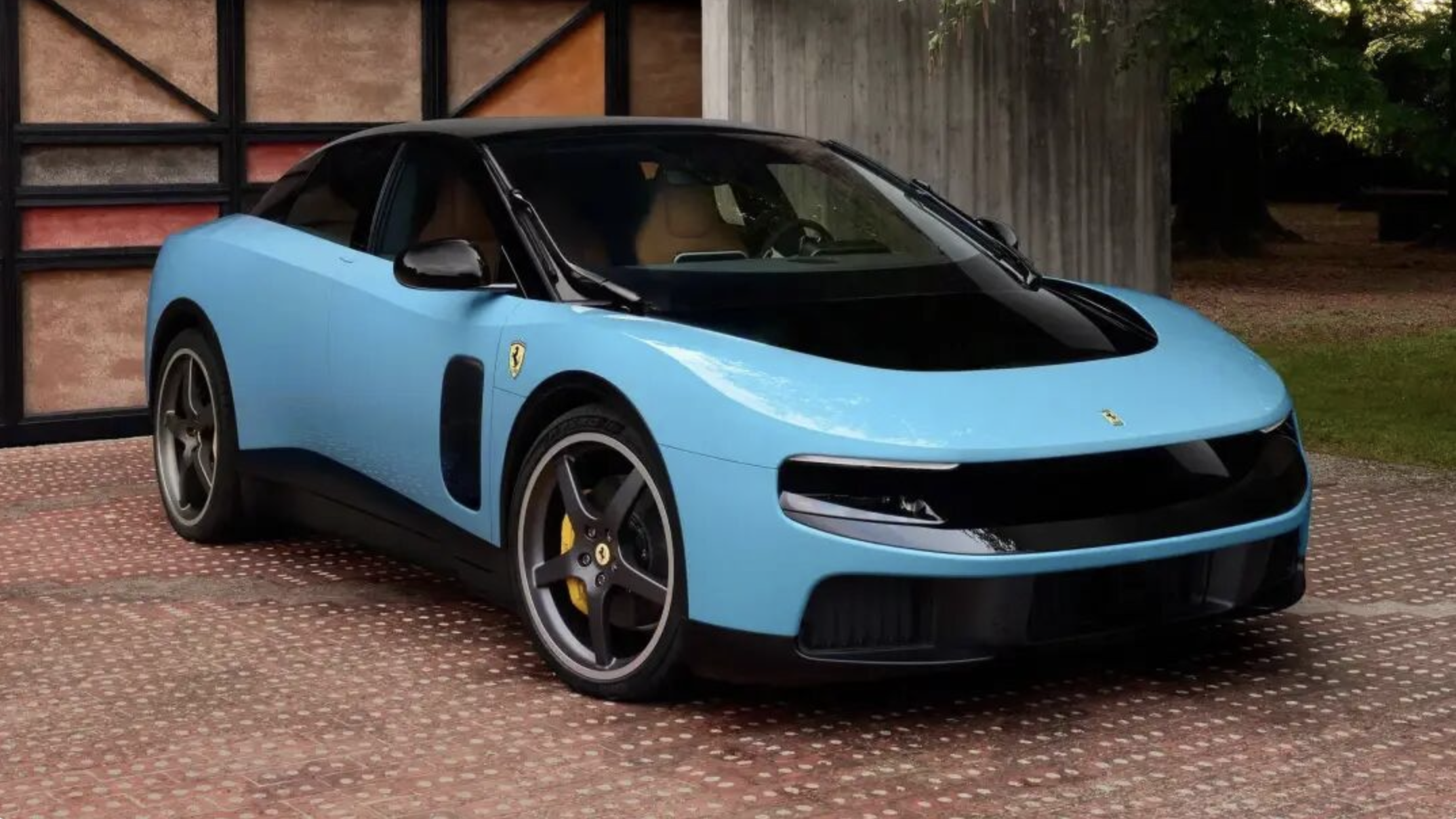
Ferrari unveiled its first electric car in Rome last week. The Luce — the first EV in the company’s century-plus history. But the car itself wasn’t what tore through design Twitter. The interior was. Jony Ive and Marc Newson, working out of LoveFrom, had done the cabin.
The press settled on one line almost in unison: the man who pried every key off the iPhone just bolted a full row of physical switches onto a Ferrari dashboard.
It’s a clean story. It’s also wrong.
His screen count didn’t drop at all
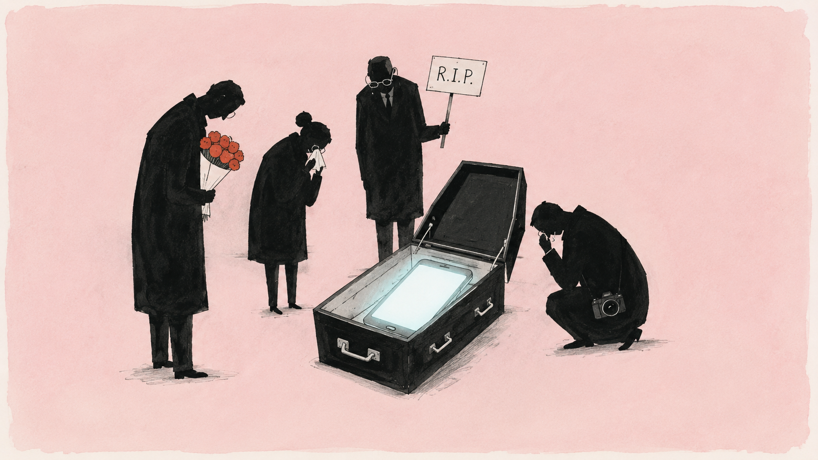
Start with what got mangled in the headlines. Ive didn’t kill the screen.
Look at the Luce cabin. The instrument cluster is two OLED panels stacked on top of each other — the upper one cut with a ring of holes so the lower screen shows through, creating real depth. A mechanical speedometer needle sits on top of all of it. The center console still carries a touchscreen: navigation, CarPlay, the usual. The screen count didn’t go down.
What changed is where the screens sit and what they’re allowed to control. Below that center display, Ive installed a row of physical toggles — temperature, fan, seat heaters. He apparently spent twenty-some rounds with Ferrari’s test drivers tuning the detent, the click, the resistance under a fingertip. The operations you used to dig through nested menus for now live under your hand, in metal you can find by touch.
Look at what the rest of the industry is doing and the contrast sharpens. The current race is whose screen is bigger, who can turn the entire dashboard into one continuous slab of glowing glass — as if a larger screen automatically meant a more advanced car. Ive sat that race out. So “he killed the screen” misreads him. What he refused isn’t the screen itself. It’s the idea that bigger screens equal better cars.
Why it had to be him
This is where the story actually gets interesting.
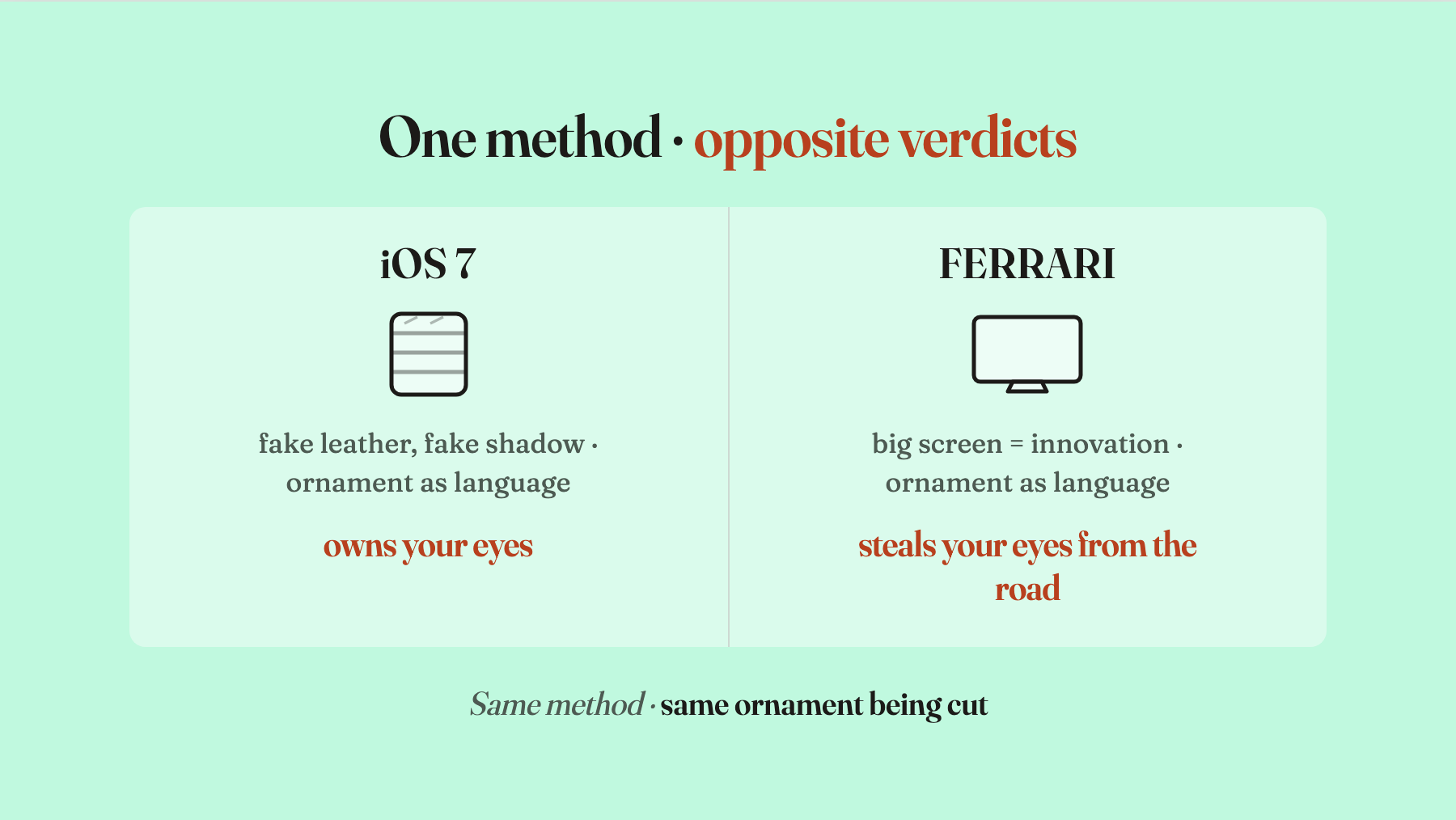
The person who pushed iOS 7’s flat-design revolution into a billion hands was Ive himself. That UI shift, put simply, took every fake-real texture off the screen — the leather stitching on the notepad, the green felt under Game Center, the gloss and shadow on every button — and scraped it flat. The same man who pulled physical keys off phones and stripped skeuomorphic decoration out of interfaces is now doing what looks like the opposite. A lot of people read this Ferrari job as Ive contradicting Ive.
Follow his actual reasoning and the contradiction dissolves. He’s been using the same ruler the whole time. Why was flattening right back then? Because once people knew their way around a phone, those fake-leather, fake-paper textures stopped helping you recognize what something was and started taking up space your eyes had better uses for. Flatness was a way to clear the visual debt so the content could come through. The giant touchscreen in a car is the same situation rotated ninety degrees. The moment that screen stops being there to help you drive and starts being there to make the car look “techy,” it becomes a new kind of decoration. And the attention it eats is exactly the attention you’re supposed to be giving the road. Same hand, same job — peeling off ornamental weight that isn’t load-bearing. The ornament just put on a “futuristic” mask this time.
Ive said it plainly in an interview: car companies saw a device that sold in the billions and concluded they should embed one in the dashboard. They studied the wrong lesson. The problems they’re using touchscreens to solve were solved a century ago by knobs, dials, and switches. The industry spent ten years turning solved problems back into problems.
There’s a more delicate layer underneath. Ive himself overshot on flat design the first time. Go back and look at iOS 7 now — it’s clearly too flat. Apple has spent every year since gently restoring depth, shadow, and layer. That’s not me arguing, that’s the design record. So the Ive standing inside this Ferrari isn’t some born-again who suddenly came to his senses. He’s the person who watched the design language he kicked off get pushed too far by the whole industry, and is now back to walk it part of the way home. Push something to the edge, then pull it back to where it actually works — he already ran the full loop on the phone. He’s running it again, in metal, on wheels.
Screens and buttons, each back in their lane
I wrote a few days ago about the industry quietly bolting physical controls back into cabins. That earlier wave was driven by Mercedes, by Euro NCAP, by faceless regulators — pushed back by accident data and safety rules, not conviction. This Ferrari moment is different. The hand doing the subtraction has a name, and that name carries some of the responsibility for the original screen worship.
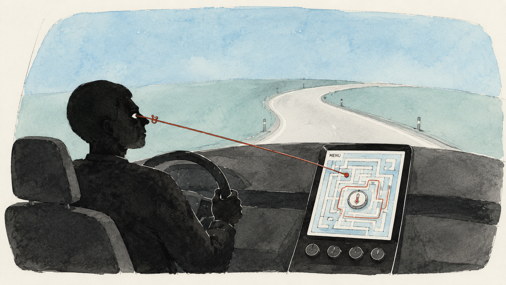
What Ive actually did, precisely, isn’t “remove screens.” It’s redraw the property lines between screen and switch. And he drew that line based on how a human actually uses a car. The driver receives the road passively; they aren’t browsing for information. Their eyes have to stay forward most of the time. A touchscreen demands the exact opposite — to nudge the temperature you move your gaze from the road to a slab of glass, hunt for an icon, then tap it. A physical switch doesn’t ask for any of that. Your hand goes there, feels the shape, the click, the throw, and the job is done without looking. So the things you read slowly, the continuous streams — maps, vehicle status — stay on the screen. The things you do constantly without looking — climate, fan, hazards — go to physical controls.
This is an interface re-layering. Which signal lives on glass, which action lives under a finger — he ran the math again from scratch. Screen things to the screen, button things to the button. It isn’t a victory for one camp over the other. It’s both of them returning to where they belonged in the first place.
Making the screen smaller isn’t a vote against technology
One last thing, before this gets misread the other way.
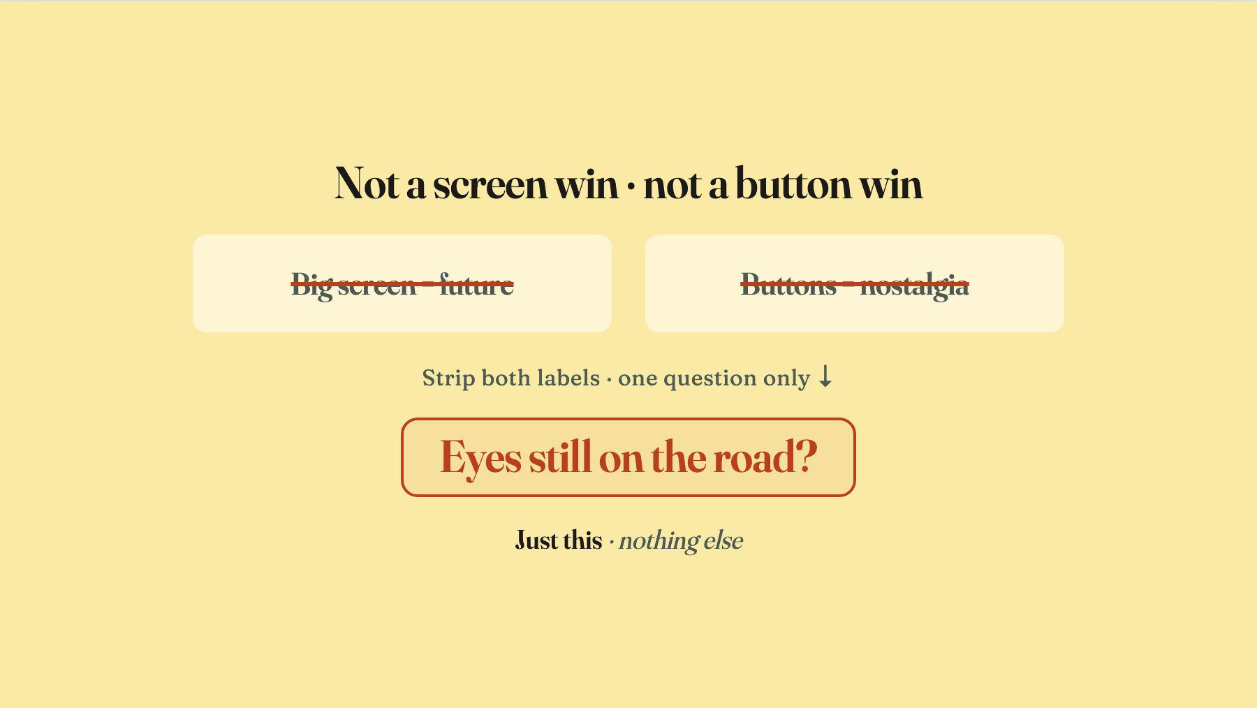
Don’t read it as “minimalism finally beat maximalism.” Don’t read it as nostalgia, either. What car companies are really selling when they turn the dashboard into a continuous sheet of glass is the appearance of being technological — the same trick from 2013, when refusing to adopt flat design supposedly meant you were old-fashioned. It had very little to do with whether the result was usable. Ive isn’t joining that race by going bigger, and he isn’t retreating to a wall of mechanical knobs out of nostalgia. He’s taking a third route. Set both slogans aside — “the big screen is the future,” “the button is the classic” — and go back to the boring question: what does the person sitting in this car right now actually need.
You don’t judge a cabin by picking a side. Screen versus button is the wrong fight. The only real standard is which design lets you finish the task in front of you and keep your eyes on the road. For driving specifically, the frequent eyes-off operations belong on physical controls, the infrequent settings stay on the screen. That’s the whole framework.
Whether the Luce’s exterior earns the Ferrari badge is a separate argument the car world will be having for a while. But on the cabin alone, Ive has made the easy-to-miss point in the clearest form available: making the screen smaller isn’t a quarrel with screens. It’s letting the screen light up only where it should. The same hand that flattened the phone interface has now lifted the big screen out of the car’s center stage — same ruler, same logic.
The ruler hasn’t changed. The person holding it has. He’s finally learned to look up before cutting — to check what situation the driver is actually in, and what they’re trying to do with the car. That look-up took him a little over ten years. One full loop. The Luce’s interior isn’t perfect everywhere, but it puts the real need back at the center of the cabin, and quietly closes out the era of chasing screens for their own sake.