Xbox just made a tiny but interesting brand move.
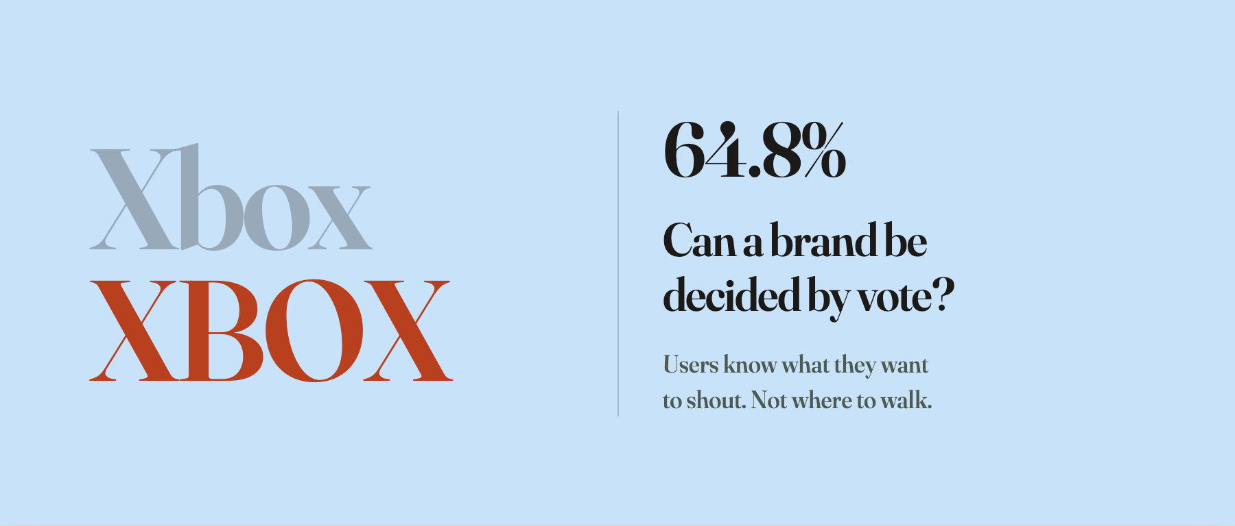
Asha Sharma, who runs Xbox marketing, posted a poll on X: Xbox or XBOX?
19,176 votes. 64.8% picked all caps.
Then the official Xbox account on X actually changed itself to XBOX.
This is not a logo redesign. Not a new console announcement. Not even a new wordmark. Just four letters going from mixed case to caps. But it’s a clean test case for a real question: can a brand be decided by vote?
The easy reading is that Xbox listened. Old-school fans miss the harder, heavier, more arcade-feeling Xbox of the early 2000s, and the company is leaning into that nostalgia by turning the volume up on its own name.
Sure, you can read it that way.
But brands aren’t volume.
A user voting and a designer looking are not looking at the same thing
When a designer looks at a brand, they’re rarely looking at a single letter.
They’re looking at coherence: how does this wordmark sit against twenty years of accumulated brand equity? How does it relate to Game Pass, to Windows, to cloud streaming, to the multi-platform strategy? Does the brand want users to feel that Xbox is a console, a service, or a games platform with several front doors?
They’re also looking at the message: what does this brand most need to communicate right now? Should it retreat to hardcore-gamer identity, or push toward a broader entertainment platform? Should it rebuild a tribal feeling of “Team Xbox,” or accept that it isn’t only a console anymore?
The person clicking the poll is not standing in that frame.
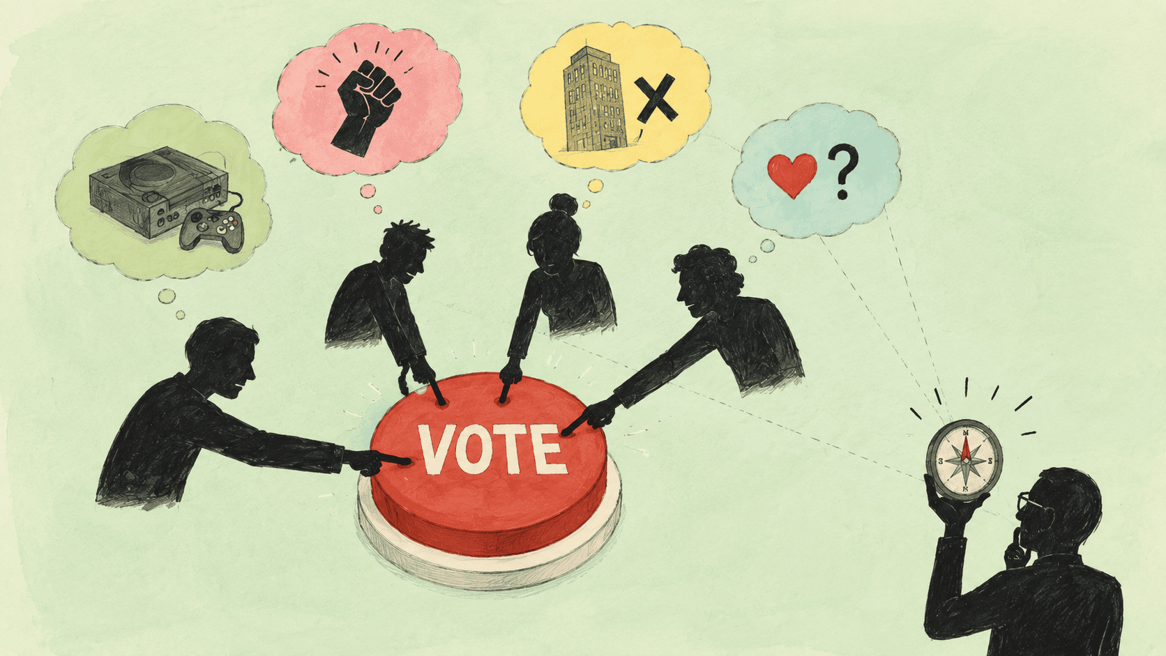
Some voted XBOX out of nostalgia. Some thought all caps just looked stronger. Some are sick of the Microsoft flavor seeping into everything. Some are venting about Xbox’s strategic drift over the last few years. Some looked at two options and picked the one that read better on a phone screen.
A thousand reasons sit under one button.
None of those reasons are fake. Each is a real feeling. But add them up and you don’t get a brand judgment. You get a number that pretends to have a single intent behind it.
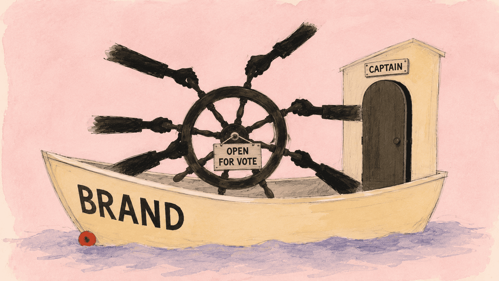
This is the trap of design-by-vote: it sums real emotions into a clean integer and lets everyone treat the integer as if it spoke with one voice.
It usually doesn’t.
A different version of “make the logo bigger”
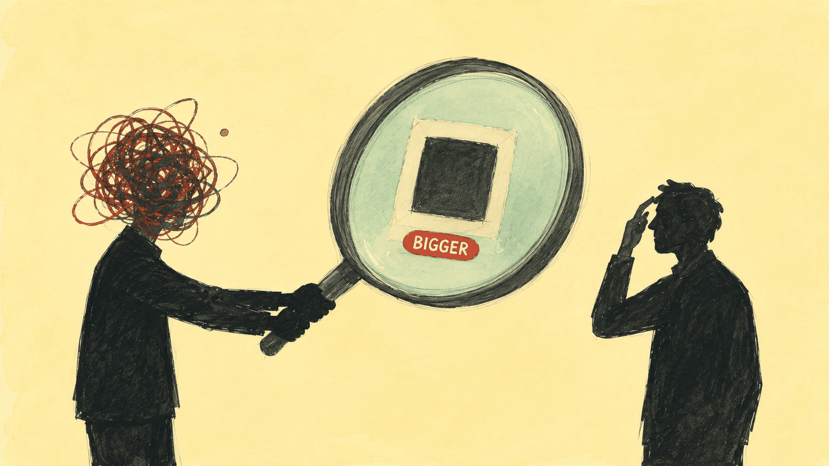
Every designer has heard this one: make the logo bigger.
When a client says it, the thing they actually want is almost never “bigger.” Maybe the brand feels invisible on the layout. Maybe the visual weight is in the wrong corner. Maybe the page lacks a memory hook.
“Make the logo bigger” is the solution they reached for. It’s not the underlying problem.
This is the same shape.
Users voted XBOX. On the surface, they picked a typographic case. But the case isn’t really what they want. They might be saying: we want a stronger Xbox identity. We want Xbox to stop feeling like a sub-brand that got absorbed into Microsoft’s product shelves. We want that 2000s green-and-chunky games-machine back.
If that’s the underlying request, then all caps is one possible response. Maybe the right one. Maybe not.
The point isn’t the vote result. The point is whether the brand team can unpack what’s actually being asked for.
A mature designer doesn’t hear “make the logo bigger” and make the logo bigger. They don’t hear “XBOX” and change the account to caps.
They ask: why are you saying it this way?
If the real want is identity, the brand should rebuild its identity system. Not change four letters. If the real frustration is strategic vagueness, the brand should clarify what it’s becoming. Not hand fans a piece of nostalgia candy.
A vote can tell you what users feel like shouting right now.
It cannot tell you why they’re shouting.
Design democracy is not a poll
“Democratic design” is a nice phrase.
But democracy in design shouldn’t mean voting.
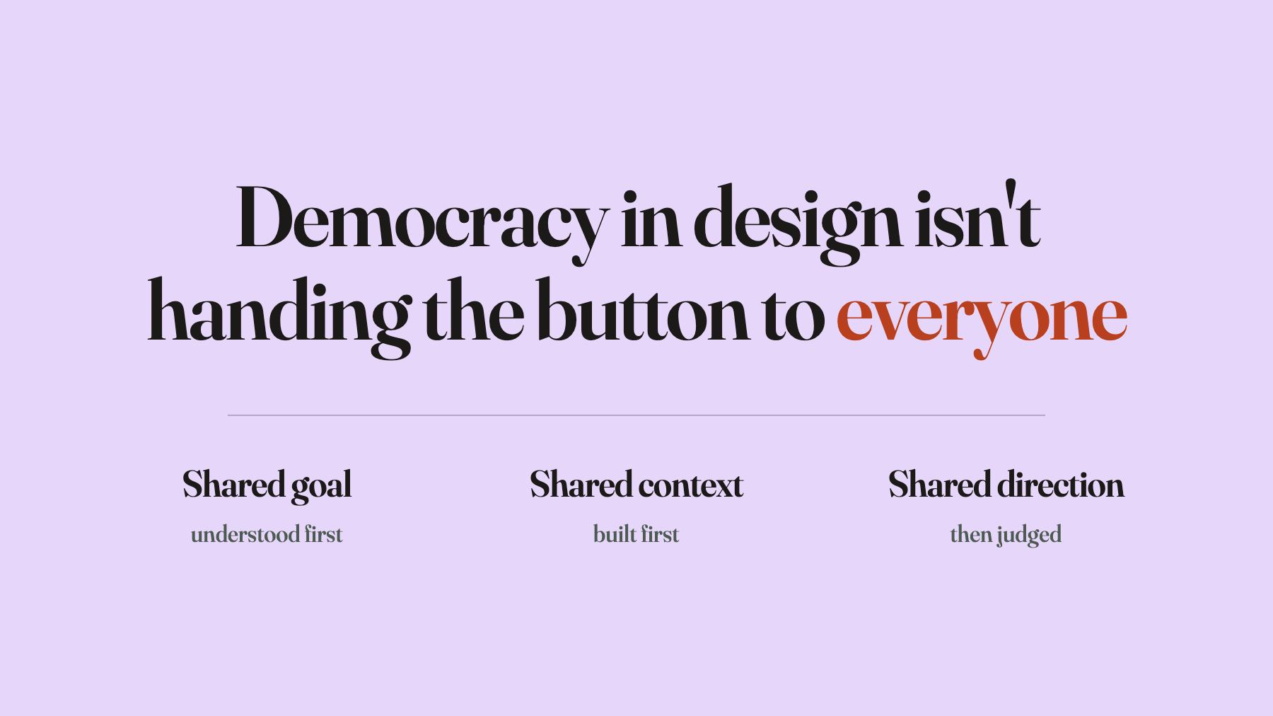
Real democratic design needs a shared premise: everyone participating understands the same goal. Are we trying to make this brand feel younger, or more trustworthy? Are we emphasizing hardware capability, or content ecosystem? Are we repairing the relationship with old players, or attracting new ones?
Once the goal is shared, then it’s worth bringing different people in to weigh in. Barely worth it, but worth it.
In practice, you can almost never do this.
You can’t explain a five-year brand transformation to ten thousand strangers on the internet. Even if you could, you’d never know whether they understood. Even if they understood, they wouldn’t necessarily vote with the goal in mind. And the medium itself rewards emotion, not careful judgment.
So most design polls aren’t democracy.
They’re emotion sampling.
Emotion sampling is useful. But it can’t be wired directly to a design decision. Do that and you get a split deliverable: each person voted for their own private reason, and the brand ends up with a number but no direction.
This isn’t the users’ fault. It’s the method’s fault.
Research is often an alibi, not a method
I’ve never quite believed that research can replace design judgment.
Research has uses. It can tell you how many people prefer A versus B. It can tell you which memory is being re-activated right now, and which emotion is running hot.
But research rarely tells you what to do.
Especially with brand. A brand isn’t a stack of preferences. A brand is a stable signal compressed out of years of choices. It needs selection. It needs exclusion. It needs long-term consistency. The danger isn’t getting one decision wrong. The danger is shifting a little every time the audience makes a noise, until the brand looks like everyone and means nothing.
Google’s famous test of forty-one shades of blue ran into the same wall. Engineering can measure click-through. It cannot tell you what this brand should grow up to be. Because brand isn’t a multiple choice question.
The 19,176 votes work the same way.
The number shows one thing: among the core fans who voted, a real majority want Xbox to feel harder, more direct, more like its past.
That signal matters.
But the moment it gets used to prove “therefore the brand should become XBOX,” a step has been skipped.
That missing step is the reason designers exist.
A brand can’t just be a response unit
The most essential power a brand holds is the power to define its goal.
Who am I? Who am I serving? What do I want users to believe? What from my past am I keeping, and what am I cutting?
These questions cannot be voted on.
Not because users are unqualified. Not because they don’t deserve a say. But because every user is standing in their own local frame. Each one has real feelings. The brand’s job is to compress those local feelings into one whole direction.
That’s what brand teams are for.
When the brand team itself has no direction, voting becomes a convenient shelter: see, I didn’t decide it. The users picked it.
This is what research most often does in commercial settings. Not a method. An alibi.
Real brand judgment can’t begin with “which one do users like.” It has to begin with: what are we trying to become?
If that question is unanswered, Xbox and XBOX are both just facial expressions.
If it’s a fan ritual, then it’s smart
To be fair, this isn’t all bad.
If Xbox knows exactly what it’s doing and is using the poll to stage a small ritual for its core fans, then I think it’s clever.
Core players have a complicated relationship with Xbox right now. Exclusives have thinned out. The line between console and platform has blurred. Game Pass turned Xbox from a machine into a subscription. The tribal sense of “I’m with Team Xbox” got diluted along the way.
Against that backdrop, flipping the account name to XBOX is a wink at long-time fans: I know you miss the rougher, more direct Xbox.
As a social media gesture, it works.
But the moment it gets read as a real rebranding method, it gets dangerous.
A brand can’t grow direction out of nostalgia. Retro can be material. It can’t be strategy. Fans can supply emotion. They can’t complete the brand’s judgment for it.
So-called design democracy is not handing the button to the crowd and counting clicks.
Design democracy is taking people’s emotions seriously, then using professional judgment to compress those emotions into something clearer, steadier, and more effective.
That step can’t be skipped.
Skip it, and what you get isn’t democracy.
What you get is a brand that looks like a lively party and has no idea what it’s trying to say.