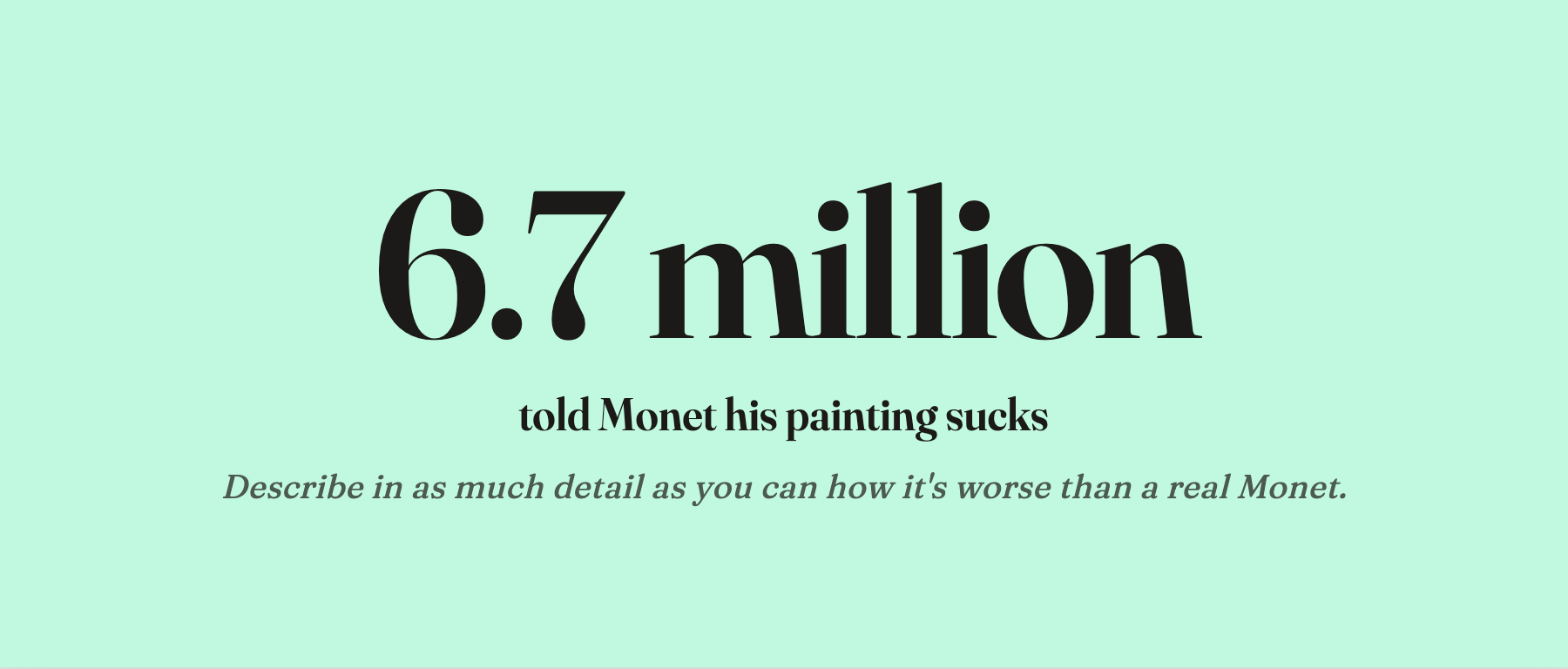
Outside the design world nobody noticed. Inside, this is the only thing anyone’s talking about.
An anonymous artist named SHL0MS posted a real Monet water lily to X with the caption: “I just generated an image in the style of Monet using AI. Describe in as much detail as you can how this is worse than an actual Monet.”
He attached X’s official “Made with AI” tag.
Less than a week. 6.7 million views. The replies poured in.
“Incoherent green mush.” “Saturation’s all over the place.” “There’s no composition.” “Cluttered garbage.” “Gets maybe 20% of the way to Monet.”
Then SHL0MS revealed the trick. Most of those comments were gone within hours.
Two people actually looked
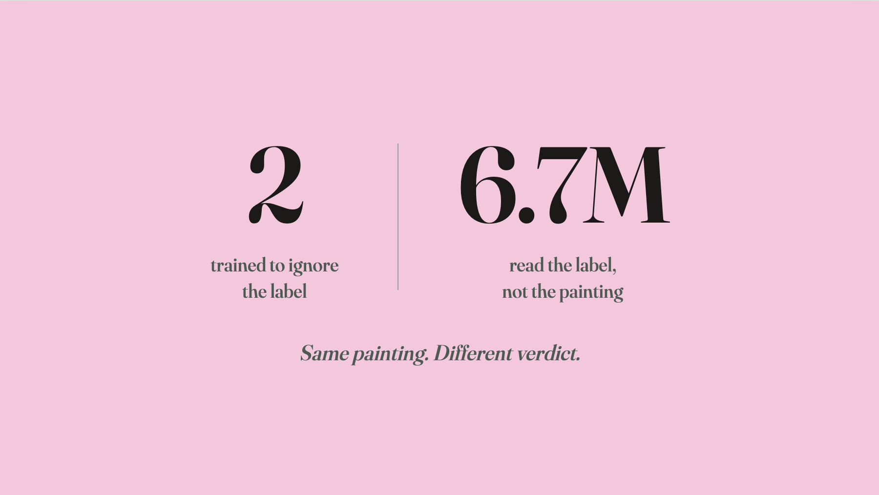
Two people on X weren’t fooled.
One was an oil painter named Kendric Tonn. He never checked the tag. He looked at the painting. “Depth planes are clear. Brushwork is credible. Not top-tier Monet, but credible.”
The other was an art historian, A.V. Marraccini. She was blunter: “This is late-period Monet detail. The brushwork is nearly identical to the Agapanthus at MOMA.”
One painter. One historian.
Out of 6.7 million people — self-styled designers, AI-art KOLs, podcasters who run shows on machine creativity, culture bloggers who skimmed two chapters of Gombrich and started reviewing paintings — every last one ate dirt.
6.7 million people read the label, not the painting
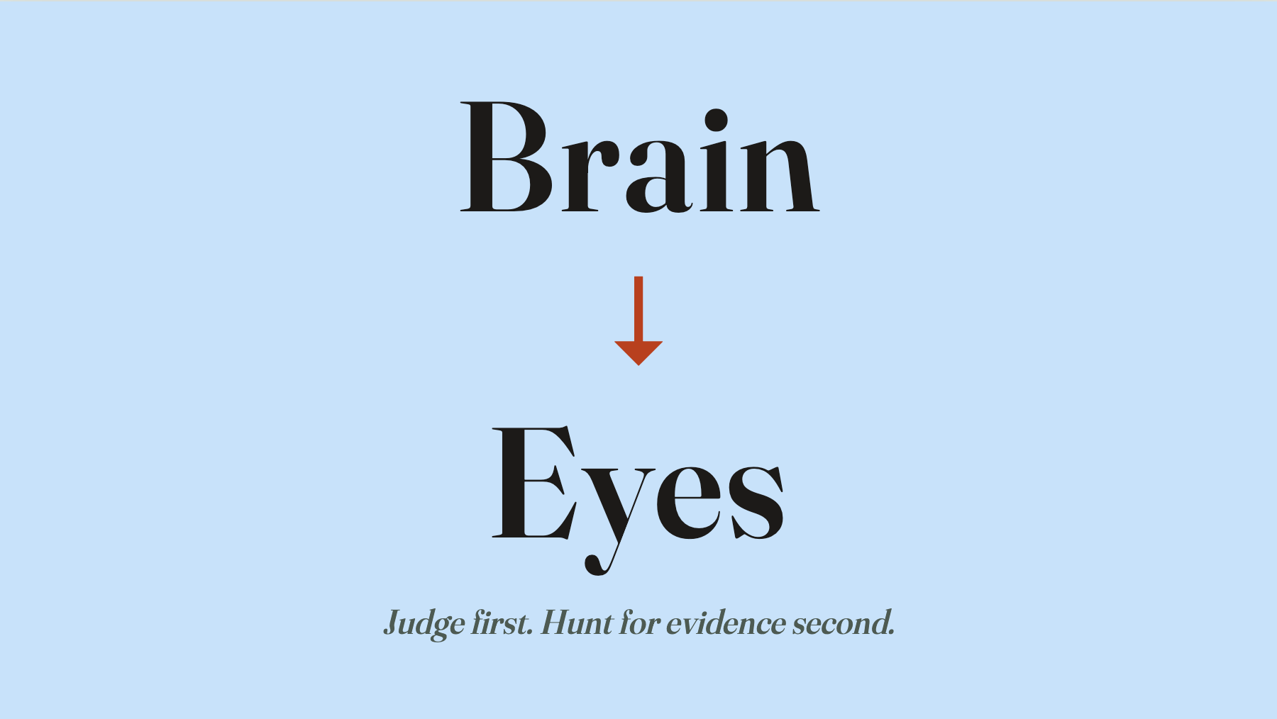
When a person looks at a painting, the eyes and the brain are on different routes.
The eyes are looking at pigment, brushwork, composition.
The brain is reading the label. Who made it. What era. What school. Machine or human. What’s it worth. Who said it was good.
Once the brain has a label, it generates a set of expectations — what I’m supposed to see — and then goes back to the eyes and cherry-picks evidence to match. You don’t see and then judge. You judge first and go hunting for evidence.
For SHL0MS’s post, the eyes saw the brushwork of a master in his late years. The brain saw “Made with AI.”
The brain won.
The instant those four words enter, the expectation engine fires up. AI-generated, right? So the colors will be muddy. No real composition. Mechanical mimicry, no feeling. Then you go back to the eyes and start hunting. And of course you find it. “That green is obviously AI muddiness.” “That brushstroke has that machine graininess.” “The painting is missing what only a real person can give.”
Did you actually find any of that? There isn’t a trace of AI in the brushwork. Once the expectation is set, you can always find what you went in to find.
A 2024 Nature paper ran exactly this test. Same painting. Tell one group “made by a person.” Tell another “made by AI.” The second group’s ratings were significantly lower. Earlier still, Kruger’s 2004 work on the “effort heuristic” showed that people unconsciously rate things by how much effort they think went in.
But SHL0MS ran the experiment live on X, with a real Monet. People today treat “AI bias” as some new phenomenon that needs lab work to prove. Monet, Cézanne, van Gogh were getting the same treatment 150 years ago, every day of the week.
Which way the wind blows
Set the 6.7 million aside. Step back.
Every designer knows this feeling. A piece of work is neither great nor terrible. It sits in the middle. Put two middle-tier designs next to each other, roughly the same quality, and the reception of each one can split completely. One gets hailed as genius. The other gets torched.
Why?
Human evaluation is a chaotic system. A small perturbation at the start gets amplified by feedback into a wildly different outcome at the end. One throwaway comment from one early voice can be the butterfly’s wing.
It nudges a small group. The small group nudges the next wave. The next wave nudges the wave after that. By the end, the wind is blowing one way. Everyone joins the chorus, praise or pile-on. New arrivals don’t form independent judgments. They go with the wind. That’s the bandwagon, in plain mechanics.
SHL0MS just made the mechanism literal. He flapped the butterfly’s wing by hand. Slap “Made with AI” on a Monet, and the initial perturbation is set. The other 6.7 million wings flap themselves.
Work that’s neither great nor terrible gets swept up. Work that’s genuinely great or genuinely terrible is mostly safe. A painting strong enough on its own can survive the chaos. A painting truly bad doesn’t get rescued by hype.
But genuinely great and genuinely terrible are both rare. Most design lives in the middle.
Even genuinely good work gets torched
Which brings me back to something I wrote about a while ago — Apple’s Liquid Glass UI.
The gist of that piece: the direction is right, the execution still needs work. The whole year has been one long pile-on. NN/g published a critical report. Medium is full of negative takes. Apple is sitting on its lowest update adoption rate ever.
Step further back, and Liquid Glass isn’t only getting beaten up for execution. It belongs to a particular category of design that gets beaten up.
Visual greatness is loud. A Monet, a Rothko, a Gothic cathedral — the eye tells you immediately. That kind of “good” comes with armor.
Some designs are good in a different register. The good is inside the system. How controls and content separate into layers. How navigation converges to the fewest jumps. Why a button has to live exactly where it lives.
That kind of good is silent. The eye sees an interface that neither flashes nor sparkles. The good isn’t visible. You have to use it, mistake it, edit your habits around it, before you slowly feel it.
Designs that are structurally good but visually flat are the most vulnerable to chaos. If the visual is middling, one flap of the butterfly’s wing drags it into the “bad” pile. A lot of good design dies in the cradle this way.
Liquid Glass is one of those, by my read. It was never going to dazzle — by design, it wants to disappear. But it solves something flat design left unsolved for fifteen years: controls and content shouldn’t look the same. That kind of good takes time to feel.
How likely is it that Liquid Glass survives the chaos period? Not great.
Design is the easiest target to throw rocks at
Step back further. Half of what designers are up against comes from the nature of the discipline itself.
Crudely, split every field into two camps.
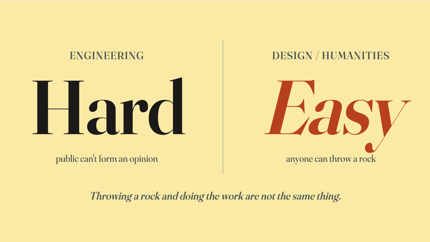
One camp is engineering. The machine either works or it doesn’t. The bridge either stands or falls. Judgment is objective. The technical layer runs deep — an untrained person literally can’t form an opinion. Engineering fields don’t get devoured by chaos. Not because there’s no controversy, but because the public isn’t qualified to join in.
The other camp is the humanities. Design lives here. The technical surface is shallow. All the depth sits behind it.
You look at an interface. Anyone can put a foot in. Color, font size, typeface, spacing — anyone can name those things. Anyone can have an opinion.
But the depth of design isn’t there. The depth is in the deliberation. The long thinking. The twenty options rejected before one was picked. The dimensions sacrificed in the trade-off. None of that is visible. It has no volume.
Shallow surface, so anyone can throw a rock. Invisible depth, so when the rocks fly nobody’s defending it. That’s a structural problem with no clean fix.
In engineering: “I get it, so I can do it.” In design and the rest of the humanities: “Even if you understand every principle, you still can’t do the work.” The gap between those two sentences is exactly the gap between what the public can evaluate and what only the practitioner can see. Your work is something anyone can judge. The hard parts, nobody sees.
Monet, Eiffel, Le Corbusier — all got buried first
One more step back. Into the archive.
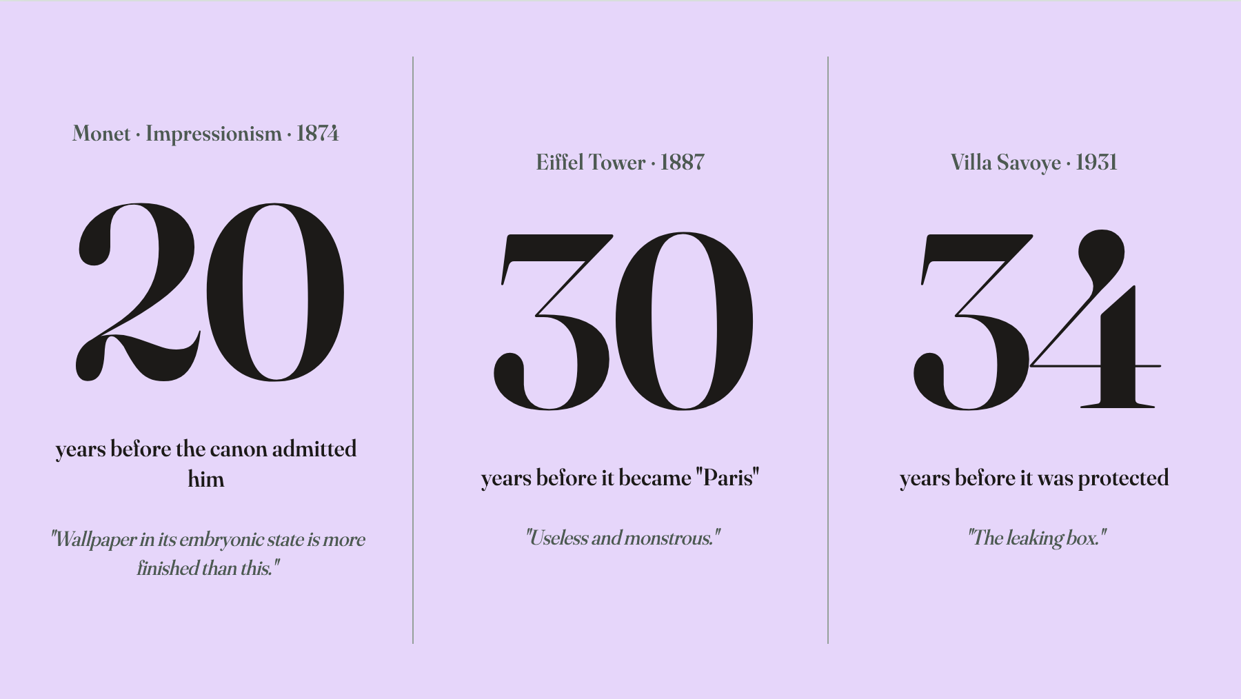
When Monet held the first Impressionist exhibition in 1874, the Paris critic Louis Leroy ran a sharp little piece in Le Charivari, taking direct aim at Impression, Sunrise. His line: “Wallpaper in its embryonic state is more finished than this seascape.”
Monet ate that line for nearly twenty years. He only turned the corner in the 1890s, when the mainstream art world began admitting Impressionism into the canon.
The Eiffel Tower broke ground in 1887. Halfway through, a coalition of the most famous artists in Paris — Charles Garnier (architect of the Opera), Maupassant (author of Bel-Ami), the composer Gounod, the painter Bouguereau — signed an open protest in Le Temps calling the thing a “useless and monstrous” piece of ironwork. Garnier called it “a truly tragic streetlamp.”
The original plan was to tear it down in 1909. It survived because it could hold a radio antenna. In 1910 it started broadcasting international time signals. Thirty years later, in 1918, Apollinaire wrote a patriotic poem about it, and only then did it become the “symbol of Paris” everyone now takes for granted.
Le Corbusier finished Villa Savoye in 1931. The family moved in. Every autumn the roof leaked — he hadn’t designed gutters, because aesthetics. The walls absorbed water. The structure cracked. The owners sued him for repair costs for years.
Thirty-four years later, in 1965, it became the first modernist building added to France’s national register of historic monuments — Le Corbusier was still alive. Fifty-one years after that, in 2016, UNESCO World Heritage.
Twenty years. Thirty years. Thirty-four years to eighty-five. This is the baseline of design history.
History rhymes, it doesn’t repeat. The “Made with AI” tag SHL0MS slapped on Monet and Louis Leroy’s “wallpaper is more finished” line sit 152 years apart. They are the same move. The public, faced with something the consensus hasn’t yet stamped, reaches for the label, not the work.
The only difference: 19th-century stamping took twenty years. 21st-century stamping is a blue badge on X. Five seconds.
History rhymes. The tempo is faster.
——
Below SHL0MS’s post, most of the 6.7 million comments are gone. The water lily is still hanging at the Neue Pinakothek.
The question for designers isn’t whether they’ll be torched. It’s how long the fire lasts.
Once in a while, a few people see the future first. By the time everyone else catches up, most of those people are gone.