Mercedes said something interesting at the Munich auto show. Chief software officer Magnus Östberg, on stage: “The data tells us physical buttons are better.” Starting in 2026, every new steering wheel ships with scroll wheels, rollers, and hardware keys — beginning with the new GLC and CLA. The funny part is the same company just rolled out the largest in-dash screen it has ever built.
It’s not just Mercedes. Around the same time, Euro NCAP changed its rules for January 2026: turn signals, horn, hazards, wipers, and emergency call must keep physical controls or you can forget about a five-star rating. The reasoning is plain — two seconds of distraction behind the wheel doubles your crash odds. Nine out of ten European buyers check NCAP scores. That puts the entire industry on the grill.
The design world’s read is almost unanimous: minimalism overshot, function finally won, common sense is back — the people who buried every button inside a screen just got slapped by reality.
Satisfying. I don’t buy it.
I’d say the opposite. This isn’t screens admitting defeat. It’s a movie we’ve already seen, playing one more time.
We watched this movie in 2013, on iOS 7
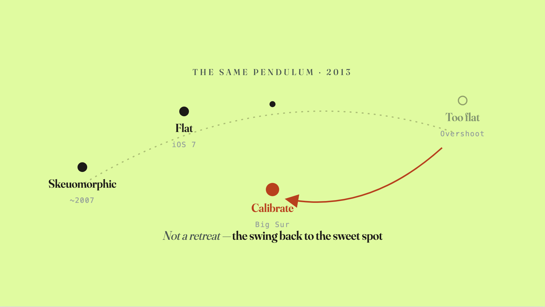
Rewind a dozen years. iOS 7. 2013. The first time a major company shipped flat design across a flagship product line.
Before that, phone interfaces were skeuomorphic. Notes had leather grain. Buttons had highlights and shadows. Icons tried to look like real objects. Why? Because when computers first landed in normal people’s lives, they were a high-abstraction novelty — nobody knew what they were for. So you borrowed shapes from the physical world. Trash cans. Folders. Bookshelves. People could read them at a glance. The mimicry itself was the design. Its job was helping people grasp an unfamiliar tool fast.
Once that tool got familiar — once everyone knew what a phone was and what it could do — the mimicry stopped being a bridge and turned into noise. Leather grain helps you with nothing. It just eats your attention. Stripping it away and flattening the surface was a productivity gain. That’s where flat design came from.
But here’s the part that matters: iOS 7, at launch, overshot. It went too flat.
I’d been designing flat UI since 2009, so this isn’t hindsight. The moment people find a direction that’s working, they push it — almost instinctively — past the point of recognizability. Far enough that you can’t tell whether something is tappable. Apple itself walked it back in pieces. Big Sur added back depth and shadow. When the Apple Pencil snaps to a surface, a little pencil flourish plays. That’s not a retreat into skeuomorphism. That’s calibration — pulling the over-flattening back to the comfortable point.
The swing out and the swing back aren’t a war between two camps. They’re one rule walking its own path.
Pushing a new language to its limit is a feature, not a bug
Here’s where people get tangled up. If we know it’s going to overshoot, why not start softer? Why not just stop at the sweet spot?
Because that’s slower.
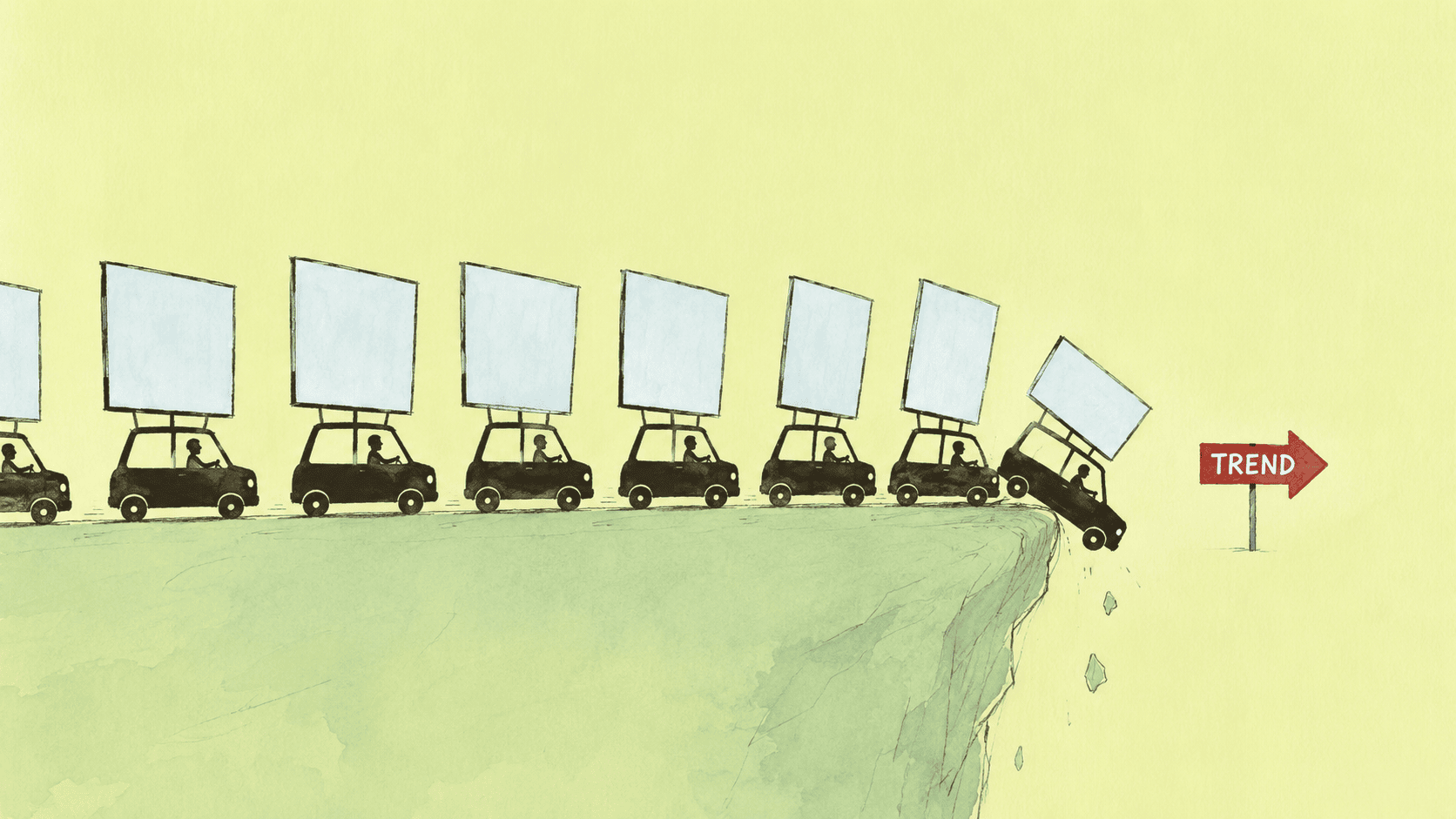
A new visual language, when it first arrives, isn’t “more usable.” It’s a fashion signal. When flat design hit, if you were still shipping skeuomorphic UI you were dated, stubborn, off the train. Big in-dash screens worked the same way. The first car to plant a giant screen in its center stack wasn’t really competing on usability — it was announcing “I’m modern, I’m the car of this decade.” Tesla put up a vertical slab and the industry put up vertical slabs, because if you didn’t, you looked like last year’s product.
The herd instinct around novelty is real. And — counterintuitively — it’s useful. The only way to find the edge of a new direction quickly is to push it all the way until its weaknesses surface. If you hedge from day one, fudge the middle, look for compromise, the edge takes forever to show up. There’s an old design line: you have to take a new language to its extreme, because that’s when its strengths and its flaws float up together.
So the “screen that does everything” inside a car is exactly that — this cycle’s push-to-the-limit. It crossed a line. But because it crossed the line, everyone now sees clearly where the line was.
The boundary is drawn by behavior, not by taste
What is that line? Behavior draws it.
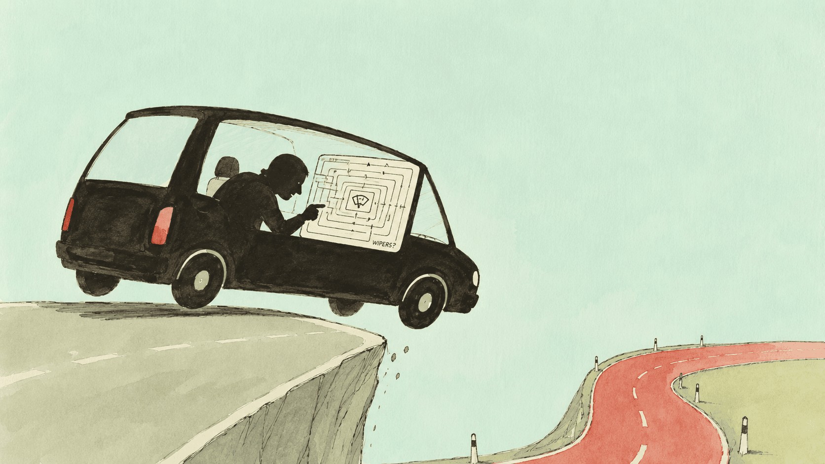
Driving puts you in a state of passive information reception, not active exploration. Your eyes and your attention belong to the road. Touchscreens demand the inverse — to change the temperature, I have to pull my eyes off the road, locate a virtual button inside some menu, then tap it. That whole sequence is anti-driving by construction.
A physical button doesn’t care. Your hand finds it. The bump, the dial, the detent — muscle memory takes over and your eyes stay on the road for the entire interaction.
Euro NCAP’s “two seconds of distraction doubles your crash odds” is really saying one thing: driving requires “eyes-on-road, sub-second action,” and touchscreens require “eyes-on-glass, multiple seconds.” The two scales don’t match. A mismatched interface is a net loss, no matter how beautiful it is.
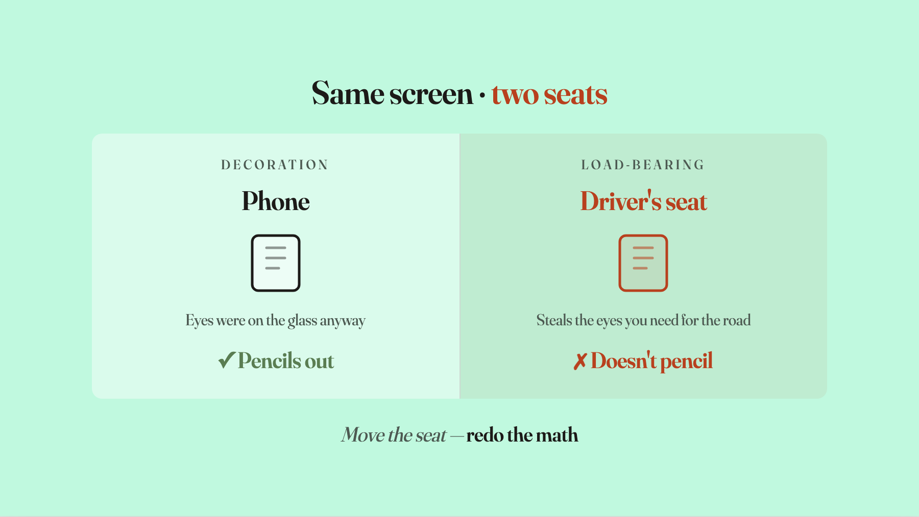
A few days ago I was defending Apple’s Liquid Glass — when a new visual language gets attacked at launch, most of the time people are confusing “unfamiliar” with “hard to use.” The car situation looks like the mirror image. A new language is getting rolled back. But it’s the same rule from the other side. Here’s the line: ornamentation is fine, load-bearing is not. The same touchscreen on a phone is fine — you were going to look at the screen anyway, so it’s at most ornamental real estate. Move it to the driver’s seat and it’s claiming the one slice of attention you need for the road. That’s load-bearing real estate. Ornamentation can be beautiful. Once it’s load-bearing, you re-do the math by load-bearing standards, and it doesn’t pencil out.
”Buttons return” is not “screens leave”
This is the step most people fumble.
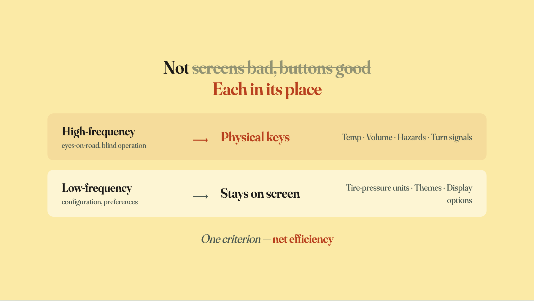
Buttons coming back does not mean cars are reverting to a dashboard covered in mechanical switches. What’s coming back is the small set of controls that are both high-frequency and require blind operation: HVAC temperature, volume, hazards, turn signals. The thousands of low-frequency settings live on the screen, where they should live — nobody wants to hunt for a physical knob to change their tire-pressure units.
So this isn’t “the buttons restored to power.” It’s an iteration of the virtual interface. Today’s calibrated-back car interior is nothing like the pre-touchscreen, switch-covered dashboards of old. Just like Big Sur adding depth back doesn’t mean it went back to skeuomorphism.
The thing to watch for is anyone reading this as “screens bad, buttons good.” That’s hopping from one extreme to the other. Judging an interface has never been “which team are you on, screens or buttons” — that argument has no content. There’s one criterion: does it raise the net efficiency of the task you’re doing? In a car, high-frequency blind operation is more efficient on physical keys, and low-frequency configuration is more efficient on a screen. That’s all.
So common sense didn’t win
Euro NCAP didn’t invent any new principle. The distraction data has been there for ten years. All NCAP did was put a number on the net-efficiency ledger — the one that had been hidden behind the fashion glow — and stamp “five-star safety” on it. That dragged the screen off the load-bearing position. The moment screens stopped being a fashion badge, everyone naturally circled back to the real question: what kind of control actually deserves to be used while driving?
Don’t read this as “common sense won.” Don’t read this as “buttons won.” The thing that didn’t change is neither buttons nor screens — it’s the rule itself. A new visual language always gets pushed to its limit as a fashion signal, then always gets pulled back to the net-efficiency sweet spot by the real behavior it serves. Overshooting isn’t stupid. It’s tuition. It’s the fastest known method for finding the edge.
The next time a new interface arrives with the message “everyone must adopt this” — whatever screen, whatever voice agent, whatever gesture system — you already know how the next few years play out. Push to the limit first. Calibrate back later.
The buttons inside the car aren’t a retro move. They’re this old rule completing one more lap.