At WWDC yesterday Apple added a way to tune the transparency of Liquid Glass. If you think it’s too see-through and the text underneath gets muddy, you drag it toward opaque and you’re done. They softened the look too: the floating buttons settled back down, the icons stopped glowing all over. Liquid Glass took a year of abuse, Apple caved, and the internet cheered.
I watched the keynote as a designer, and Apple did two opposite things on that stage. One was right, and the whole internet trashed it. One was wrong, and everyone clapped.
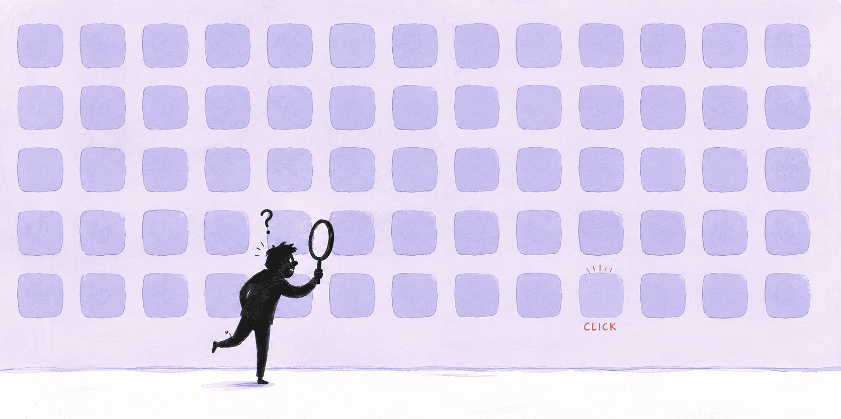
You can’t read this from the cheap seats. You have to leave the surface and dig.
First, an apology Liquid Glass is owed
The thing people spent a year dragging? It wasn’t wrong.
Go back to iOS 7. When it flattened everything, the whole interface collapsed into two layers: content (the words and pictures you want to read) and controls (the buttons and menus you want to tap). The two layers looked the same — both just colored shapes and text. That bred a particular kind of confusion you feel every day but can’t name: a line of blue text, and you can’t tell if it’s a link or just emphasis. A rounded colored rectangle, and you can’t tell if it’s a button or the background of a card. Every time, you pause half a beat to guess whether it’s tappable. Multiply that half-beat by a few hundred times a day, by ten years, and it’s a staggering hidden tax.
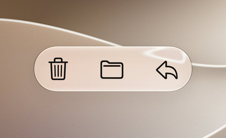
Liquid Glass exists to kill that tax. It puts every control under a layer of glass that refracts what’s beneath it, so the control genuinely floats above the content. Floating and catching light means tappable. Sitting quiet underneath means it’s there to read. It takes the question “can I tap this?” out of your head entirely.
And it’s cleverer than that. There were plenty of ways to separate the two layers — a shadow, an outline, take your pick. Why this heavy, showy glass? Because it solves two things that fight each other: make the control visible, but don’t let it crowd you.
Skeuomorphic buttons were three-dimensional and lifelike. Plenty of presence, but far too much weight — maybe a third of your attention went to the fake leather and brushed metal wrapping the thing. Then flat went too far the other way, and controls dissolved into the content. Liquid Glass lands exactly in the gap: it has a clear physical presence, so you see it instantly, and it’s transparent, almost invisible, so it never steals the scene from the content underneath. Visible without being heavy — nobody had ever held that spot. And it doesn’t care what device it’s on: phone, watch, all the way up to Vision Pro. One language for everything Apple makes.
NN/g, the usability shop that nitpicks interfaces harder than anyone, went after it: Liquid Glass only hit a 45% adoption rate, they mocked the text-over-image mess in Messages as “Dan Brown-grade cryptography.” That reads to me like playing to the crowd. Everything they listed is fixable with iteration. None of it proves the direction is wrong.
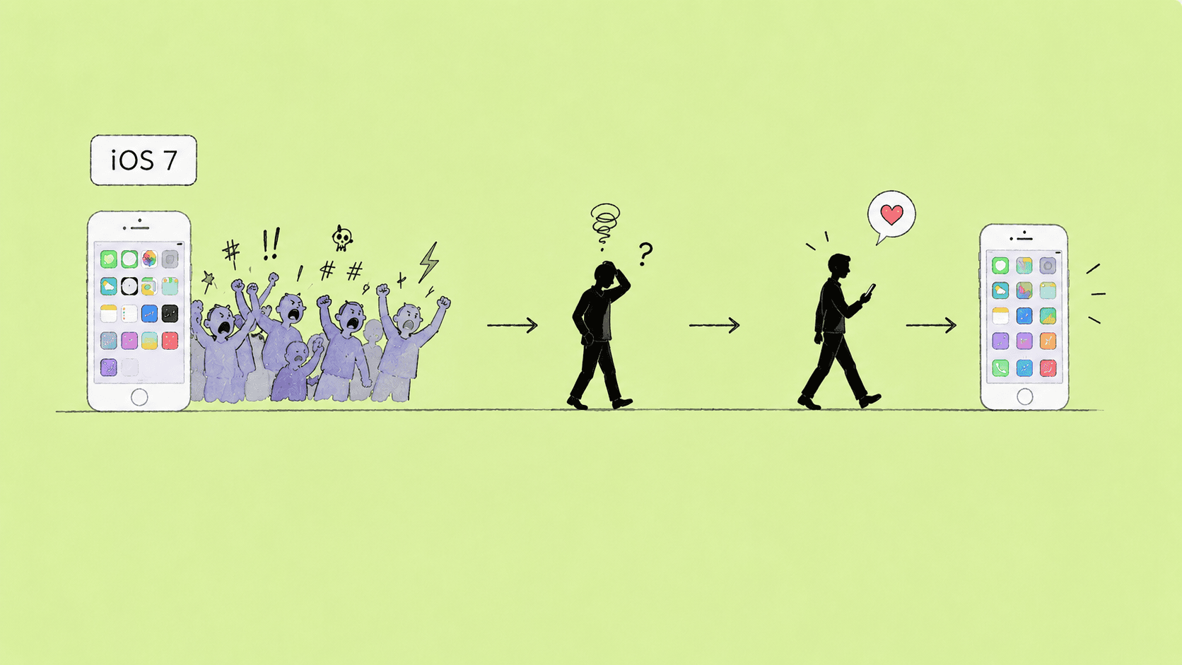
We’ve watched this exact movie before. The year iOS 7 kicked off the flat wave, it got dragged just as badly, and pretty soon everyone settled in. A new language always feels unfamiliar first, and people are terrible at telling “unfamiliar” apart from “bad.” The beating Liquid Glass took this year is the iOS 7 beating, frame for frame.
Now, where Apple actually blew it
Apple added a transparency control this time, and a lot of people nodded along — Apple listens! That nod is the mistake.
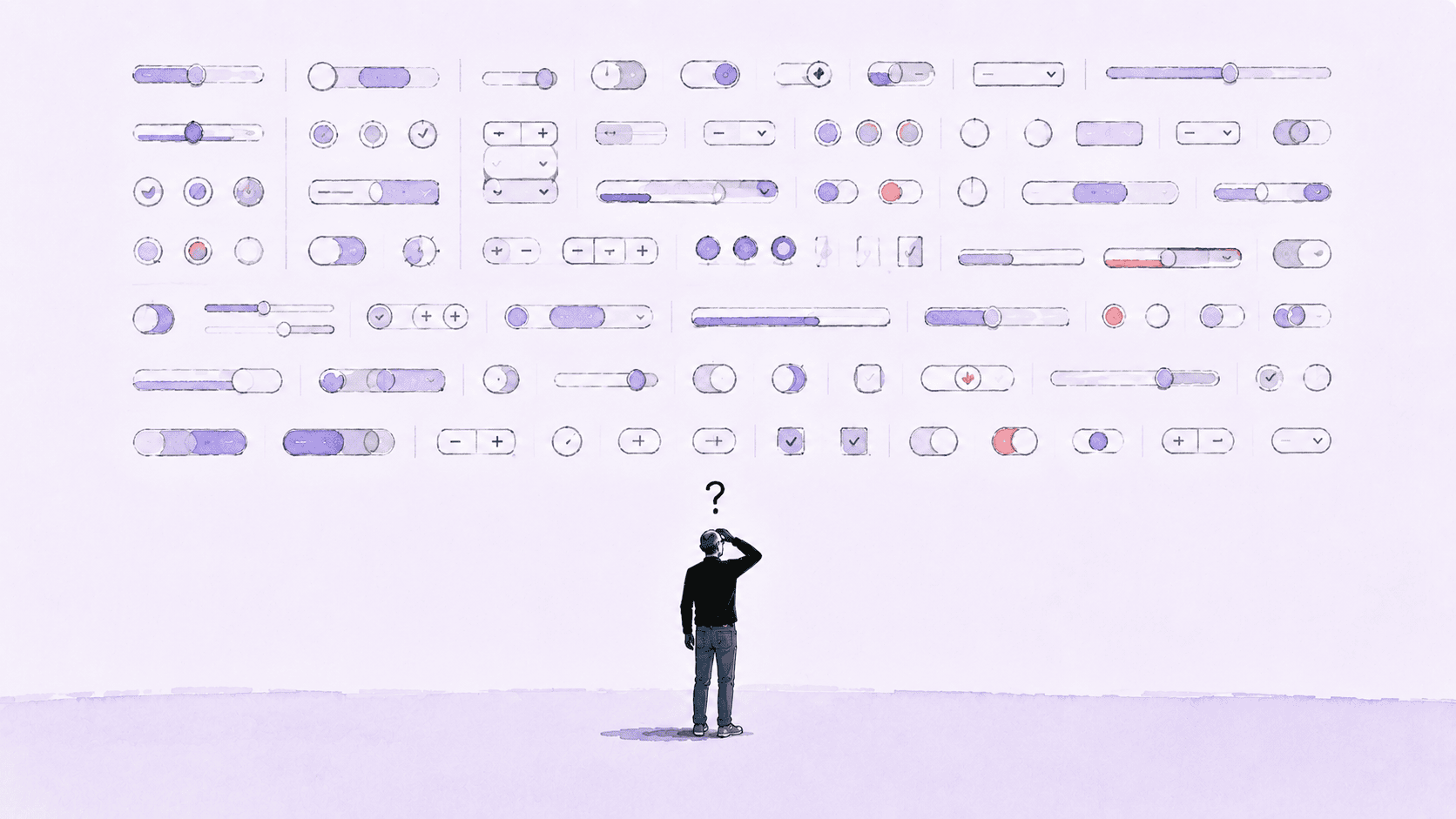
How transparent should this glass be? That’s a judgment call. A little transparency looks good and feels light; too much and the text turns to mush. You have to find the right point between “looks good” and “stays legible.” That point was Apple’s job to find for you.
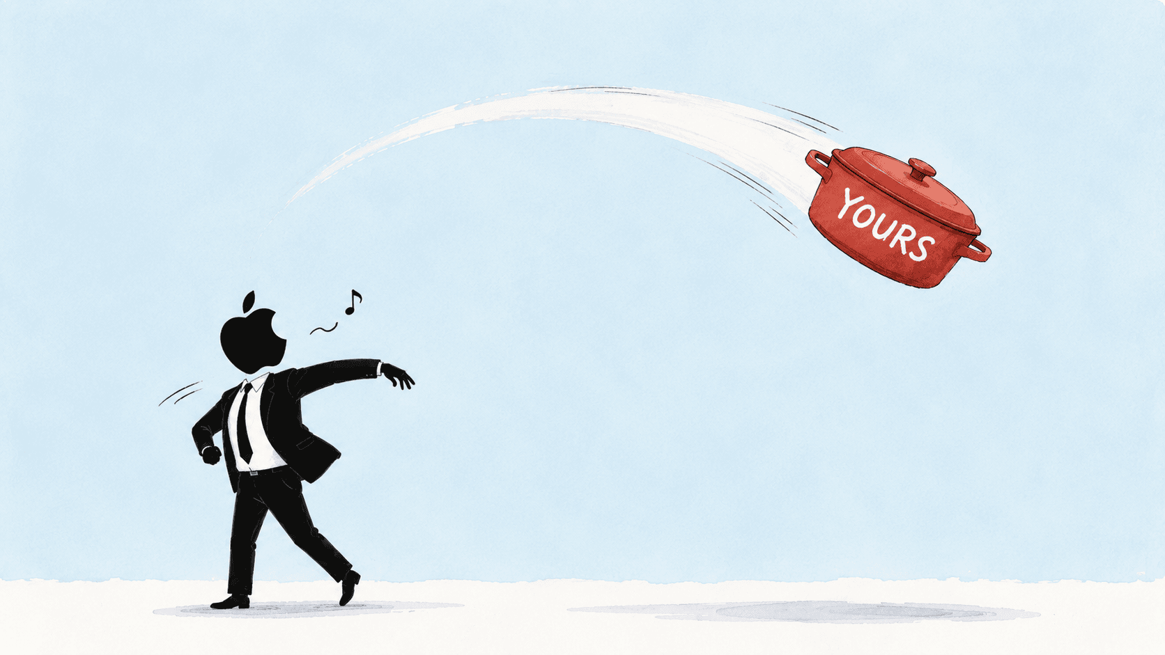
Instead Apple handed the “right” back to you. They built a slider, dropped the question in your lap, told you to figure it out yourself and own the result — so stop complaining. The icons go further. Open them up and you get hue and saturation sliders, plus an eyedropper to pull color off your wallpaper. A whole kit that says you sort it out. The buck, cleanly passed.
And the internet applauds, says Apple finally respects its users. Sit with the absurdity of that. The way you’re being “respected” is by getting handed a chore that was never yours.
Someone will defend the slider: what’s wrong with an option? Tune it if you like it, ignore it if you don’t.
That swaps out the one concept that matters. It dresses up a functional judgment as a matter of taste.
Those are not the same thing. Which wallpaper to pick, how to arrange your icons — that’s taste. No right answer, suit yourself. But how transparent the glass should be isn’t taste, it’s function. Transparent to the point where you can’t read the text is wrong, no matter how pretty the user finds it. Apple just took a question with a correct answer and wrapped it in “respecting the user.” That isn’t freedom. It’s offloading the responsibility Apple should carry onto someone who was never trained for it and never signed up for it — you.
And most people will get it wrong, not because they’re dim, but because it was never their job. Judging how much contrast is enough is a skill designers grind for years. Why would anyone expect you, dragging a slider on the couch, to land it? The result is a sea of phones with garish icons you can barely read. Apple handed the wheel to someone with no license and called it respect.
Apple is giving away the most valuable thing it owns
Apple thinks it’s dumping a burden by pushing the hard call onto users. What it’s actually dumping is its own last line of quality control.
What happens next isn’t hard to picture. Plenty of people will dye their icons until they’re painful and drag the glass until the text vanishes, and the moment it feels bad they’ll say “Apple’s software keeps getting worse.” You did that to yourself, you might protest. Users are never that rational. Ordinary people can’t separate “Apple’s original design” from “the mess I made of it.” In their eyes it’s just Apple’s software, and the blame lands back on Apple.
The blame Apple threw out comes around and lands square on its own logo. That’s the hidden cost of handing the judgment back: it looks gracious, and everyone loses. The user is stuck with a mess they can’t clean up, and Apple spends down the “it just works” reputation it took decades to build.
Apple’s most valuable asset for forty years was never a feature or a screen. It’s the nerve to make the call for you.
Closed, no negotiating, what it decides is right is right, and if you don’t like it you use it anyway — that’s the real Apple. The premium you happily pay buys exactly one thing: I don’t have to think about it, it knows better than I do. Windows and Android throw the doors open, change your skin, swap your theme — that’s their promise, openness. Apple’s whole character is the opposite: it already made the choices for you. Handing that right back, for Apple, is self-sabotage. It takes the “you don’t have to think” you paid for and personally returns it to you.
Microsoft used to be the king of go-ahead-and-break-it. Third-party hacks could turn a desktop into something its own mother wouldn’t recognize. But it’s been pulling back for years — that anything-goes era has shrunk into tidy, bounded personalization. Why pull back? Because it figured out the math: letting users change everything looks like a gift in the short run and costs you in the long run. When the system gets wrecked, the bad reputation comes home to you.
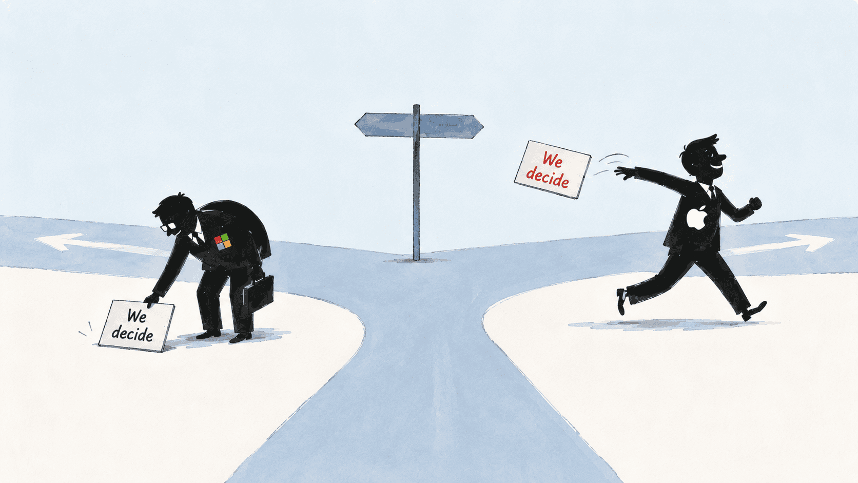
Microsoft hit this intersection and turned around. Apple does the exact opposite — floors it, straight down the road Microsoft just backed out of. History has a sense of humor.
What gets booed isn’t wrong. What gets praised isn’t right.
Look back at the keynote and the thing worth remembering is the strange part: the direction that got booed for a solid year, Liquid Glass, was right. The iteration everyone clapped for, that slider, was wrong.
Booing and applause are both noise. There’s only one ruler for whether a design is good, start to finish: did it take the burden off you, or did it hand the burden back? The first is good design no matter how loud the boos. The second is a regression no matter how loud the praise.
Apple is most itself when it’s the high-handed Apple that dares to decide for you and doesn’t fear the backlash. The day it starts smiling sheepishly and inviting you to pick for yourself might be the day it quietly stops being Apple.
This one small slider is probably just the start. I’m a designer and I love Apple. What it did for the design field and for me personally is hard to put into words, so I don’t want to be the one saying “Apple has started its decline.” But a small thing can tell you a lot, and this is a warning sign.
How Apple got here, the exact moment its make-the-call-for-you culture started to loosen — that’s a deeper account. I’ll set aside a separate piece for it next time and trace the whole thing back to where it began.