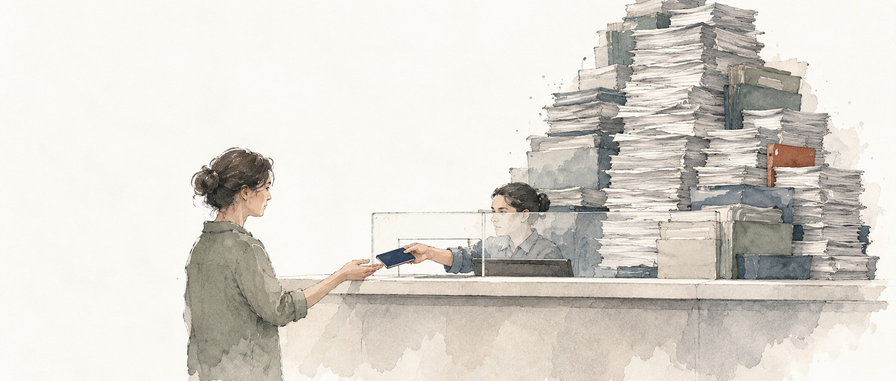
On September 29, at the America.gov launch, the US secretary of state demonstrated a new passport application process and unveiled a redesigned American passport. After watching, I wanted to talk about the team behind the event: the National Design Studio, or NDS.
A government has set up a design studio to make dealing with government easier. As a designer, I think that is a significant moment.
We often say design creates value. When it starts working on passports, retirement applications, and prescription drug searches, that value reaches well beyond a brand or a product. It changes how people deal with their government every day.
Giving public service its own design team
An executive order established the studio in the White House in August 2025, with Airbnb cofounder Joe Gebbia at its head. Its remit covers digital services, physical experiences, and even how the nation presents itself.
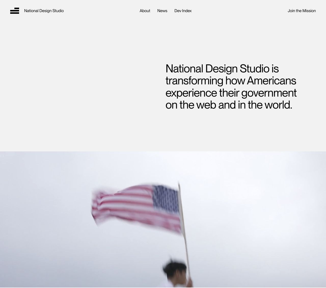
Creating that institution is itself a formal recognition of what design can do.
Confusing instructions, requests for information you have already supplied, no obvious next step: these used to be easy to dismiss as just how paperwork works. Now a dedicated team has a job to fix them. Whether people can understand and use a service has become part of the government’s own brief.
And the studio sits in the White House. The executive order requires agencies to work with the chief design officer, prioritizing websites and physical services that affect daily life. That gives designers a chance to work across departments and consider the whole experience, from starting an application to getting it approved.
That is worth welcoming. Designers get a say in how a public service works, well before someone asks them to make the graphics.
This is not the world’s first government design institution. Still, formally putting a design studio in the White House and showing its contribution through actual projects is a substantial step. Design has a clearer place in government, and the public gets a clearer view of what it can accomplish.
I recommend visiting the National Design Studio website. It lists the projects the studio has worked on: the prescription drug site TrumpRx, food information at RealFood, retirement applications, scientific research, and recruitment. Designers can see where their skills might take them in public service. Everyone else can see how familiar government processes might work better.
Retirement forms should show you what to expect
A federal employee preparing to retire has some immediate questions. How do I fill this out? Roughly how much will I receive each month? What do I need to do next?
The retirement project presented by NDS puts those answers in the interface. The system fills in existing records, including employment history, for the applicant to check and complete. As it guides them through the form, it also displays an estimated pension.
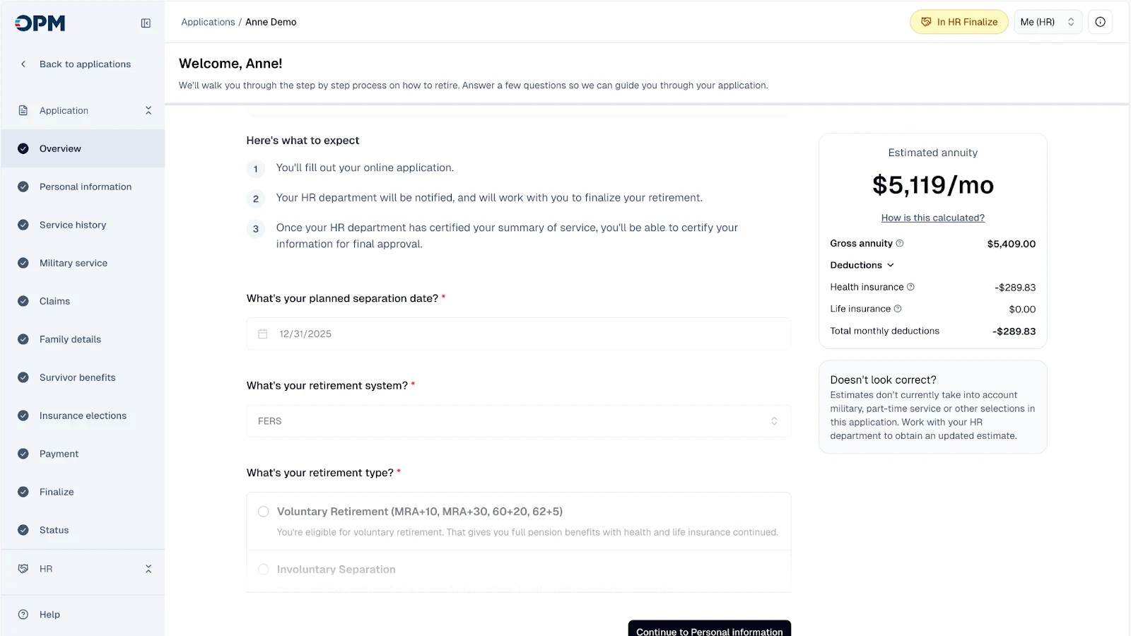
The benefit is immediate. You do not have to assemble information the government already holds. You can see sooner how the choices you are making will affect your retirement income. Filling out the form also helps you understand what to expect, which makes a consequential decision less uncertain.
The steps listed on the left show where you are and what remains. A complicated procedure becomes a sequence you can follow. You do not have to read a pile of instructions before you feel ready to begin.
The redesigned system launched in June 2025, before the studio was formally established, and was later included among its projects. The Office of Personnel Management subsequently pursued further changes to shared electronic records and processing across agencies.
I like this example because the relief is so specific. One less piece of information to enter twice. An earlier idea of what you will receive. A next step you can identify. That is the practical value of designing public services well.
TrumpRx deserves a closer look
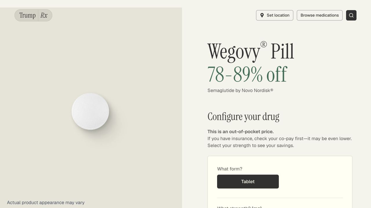
Of these projects, TrumpRx especially rewards a closer look. It brings prescription drug prices, discounts, and ways to obtain medication into a searchable website. NDS led both its design and development.
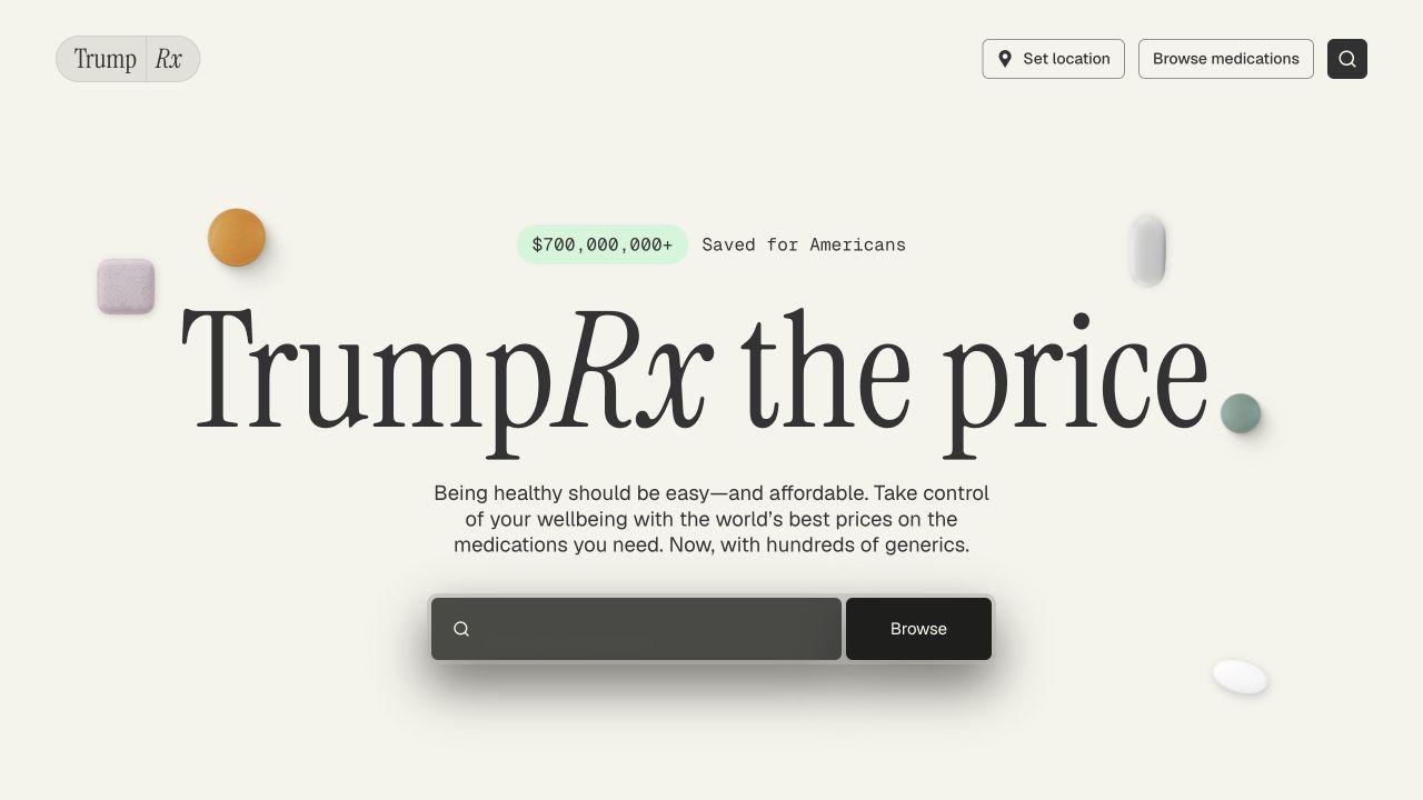
It looks unusually good for a government website. It is also easy to understand. This is a thoroughly considered piece of product design.
Medication is presented as a recognizable physical object, rather than just an unfamiliar name beside a price. Headings, explanations, and buttons have a clear visual hierarchy. A glance tells you where to look.
Search is equally straightforward. Most visitors already have a drug in mind, so the homepage puts medication search right in front of them. Type a name or browse the drugs. You can begin without first learning how the website organizes its information.
I particularly like the insurance reminder. It tells visitors that the prices shown are out-of-pocket prices. If you have insurance, check your copay first: it may be lower. That information appears where you make your choice, making it easier to judge what works for your circumstances.
Government services deserve this care in their appearance and details. They serve ordinary people, who should be able to understand and use them as easily as the good products they use every day.
Open the TrumpRx website and have a look. Go beyond the homepage to a medication page. Notice how the typography, images, buttons, and information work together. For designers, it is a useful public service product to study.
Government gets a product launch
Back to the September 29 event. Even the way it was presented caught my attention.
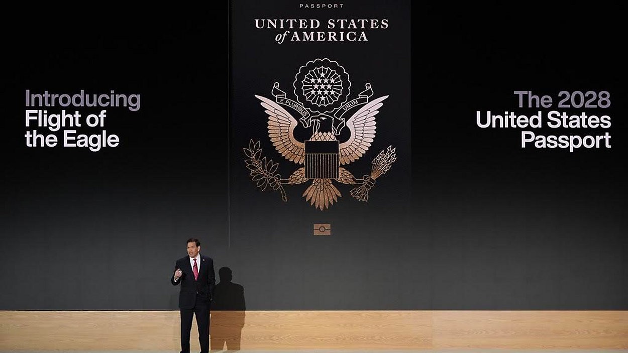
The secretary of state began with the hassles an applicant faces: finding forms, making appointments, getting photos taken, waiting. He then demonstrated the new application process before showing the physical passport. The presentation followed a person’s experience of applying. It did not work through a departmental inventory of completed tasks.
Technology companies launch products this way all the time. Seeing a government do it feels significant too. It is presenting itself as a provider of products and services, showing citizens how they will actually use them.
In the demonstration, for instance, you could take your passport photo at home with your phone, preview it in the passport, and retake it if you did not like it. Those details make the improvement visible. You need no technical knowledge to understand which hassles they remove.
After the application demonstration, the secretary of state even said, “one more thing.” Then the screen played a video of the new passport.
A nice little flourish. But what matters more to me is that an official document was treated as a product worth launching properly. The application should be easy to use; the object you receive should look good. Even its packaging belongs to the same experience.

The cleverest detail is the bald eagle. A national symbol appears across successive pages; flip through them quickly and it flies through the historical scenes like a flipbook animation.
Turning pages is something a booklet already invites you to do. The designers use that ordinary action to animate a static symbol and connect separate historical images into a story. You encounter the country’s history and symbols in an object you can hold.
A document gains a detail worth noticing, a reason to turn its pages. The design attends to the convenience of applying and to how it feels to receive something important.
As for timing, America.gov is already available for information searches. The passport application functions demonstrated at the launch will roll out in phases, and the new passport is scheduled to enter use in 2028.
Public services deserve this much care
I think this work deserves praise.
The most meaningful thing about NDS is that the government has assigned a design team to care about how ordinary people get things done. Is a service understandable? Is it convenient? Does it look good? These are now questions worth professional attention.
I have always believed good design makes the system handle the complexity so the person using it gets a simple result. A retirement application that spares you repeated paperwork, a drug search that makes prices easier to understand, a passport application that lets you upload a photo you like: each puts that belief into practice.
Taken separately, these are small things. A form. A photo. A button. When large numbers of people use them every day, a little less trouble adds up to considerable value.
For designers, this shows where else our profession can take us. Design can help governments serve citizens better. It can make a serious official document attractive and easy to use, something people want to treat with care.
I want to see more of this work. Public services deserve the attention we give our best products. Every person who comes to use them deserves an experience that is clear, convenient, and thoughtfully made.